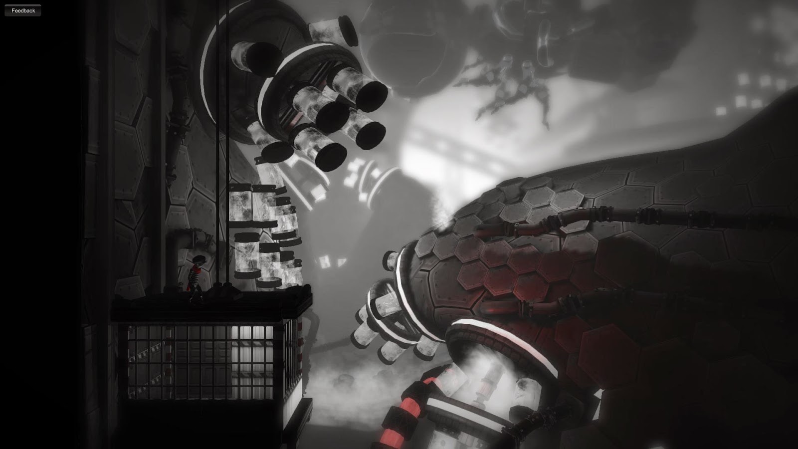
It is impossible to see this game, and not draw comparisons to Limbo, the award winning and critically acclaimed game from Playdead released in 2010. Both have a very clear yet subdued visual style which are linear side-scrolling platformers, more focused on adventure and experience than action. Light puzzle solving along the way keeps you engaged as you transverse a very deliberate landscape. Heck, both games even deal with the bond between siblings, though Limbo makes reaching your sister the goal, while Monochroma has you protecting your brother along the way. But where Limbo was tight and meticulous, Monochroma seems sloppy incomplete. While this review will not be a direct comparison of the games, it is worth noting the swath of similarities - and with that, I shift focus solely to Monochroma.
Opening with you and your brother frolicking in a countryside field, the game turns to a theme of brother love and urban industrial exploration. The developers bill the game as an alternate version of the 1950’s, and use the phrase “industrial-alchemic,” though the developers are Turkish so I am not sure if there is an odd translation issue there. This is a 1950’s where factories pump out rudimentary robots for families to buy and serve them at home. As your brother gets injured in your cornfield romp and a storm looms overhead, you venture deeper into the city and these factories, often pursued by a generic 50’s era “tough guy” or solving simple puzzles. While this could be an interesting setting, it is fairly well worn, and little is done to really explore new deeper than the surface visual inspiration.
The game presents a handful of well composed set pieces, but there is quite a bit of uninspired filler, and the generic design and clunky animation spoil those small moments. Running through the cornfield, seeing your brother fly a red kite by your side, or your first time entering the city and industrial areas is beautiful and refreshing. But there are scenes of puzzle solving in generic factories or apartment rooms. Chase scenes through parking garages and bridges. A good old, bog standard, blocky vent puzzle. To make matters worse, your characters movement through these environments is poorly executed. My senior year of college I was in a 3D design project, tasked with modelling and animating a short story with a group of colleagues. The work that we, as a group of students, completed in a few weeks looked and moved in a similar way to the character here. Very jerky and deliberate changes in animation, odd looping of animation, and even rote character modelling. It feels like everything is more of a first project or proof of concept, and not a full fledged $20 release.
Audio does very little to add to the experience, and is rather abrasive. Short musical loops and harsh sound effects resulted in me lowering the volume and listening to other music or podcasts. These other endeavors also helped keep my attention when drudging through long, plain scenes, and kept my sanity as I attempted the same section for the umpteenth time.
Issues don’t stop with design blandness - they continue through to the very core of the mechanics. Within the first 10 minutes of the game there is a short jumping puzzle that took me 25 or more tries to finally get up. Turns out, I had to have my left analog stick at a perfect 45 degree angle - no more, no less - for him to reach out and grab the ledge. This is something that was never explained, and didn’t even feel consistent throughout. I routinely got stuck climbing a ladder during elements where timing to move to the next area was crucial. Chase scenes or time-based puzzles all felt stressful and frustrating, and through no fault of my interaction and planning. There was never a time where I did not know what I wanted to do, but there were plenty of times where I had to do multiple attempts to get the loose, unresponsive, even combative controls to meet my needs.
As a package, the experience is a paltry sum of its parts, no more, no less. What could have been a charming tale about brotherly love in a harsh time falls prey to inexperience and lack of polish. Every aspect suffers from haphazard implementation, with only brief glimmers of what could be evocative and enjoyable shining through. It feels incomplete.
Final Score 3 out of 10
Review by Parker
We score our games on a scale up to 10. You can read more about what we look for in a game in our Game Library page. Want to know more about the people writing our reviews? Go ahead and meet the team. Agree? Disagree? We want to hear your opinions either way - so feel free to leave a comment below and thanks for stopping by!


