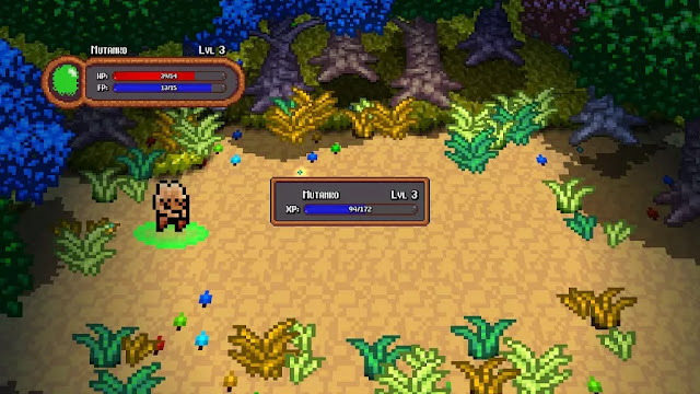
• Metal Slug Tactics - PC Review

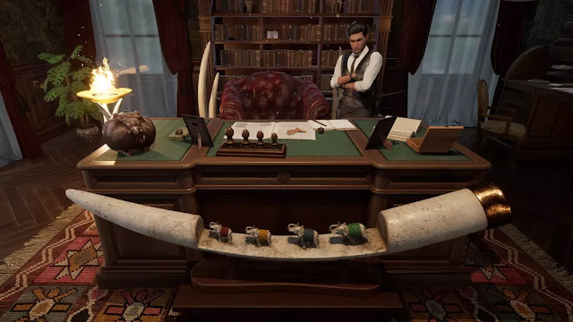
    The Metal Slug series has been around for a long time, and despite its age, the titles tend to stand the test of time. They have a fun, colorful visual style that ages gracefully...

  • Eden Crafters - PC Preview

    In this open-world game you are challenged with turning a hostile planet into a habitable haven for all of human kind. You have the ability and equipment to temper the climate, and to create a breathable atmosphere!

  • Dungeon Inn - PC (Steam) Review

    Dungeon Inn is a cozy strategy management game that has an amusing story. The premise? Sara and her crew end up trifling with a scary dragon who catches them red-handed stealing from him.

  • Shadows are Alive - PC(Steam) Preview

    Shadows are Alive is an interesting sort of mash-up of a lot of fairly popular titles coming together to create a pretty solid premise. A weird mix of Player vs. Player, puzzle solving, and exploration...

  • V Rising 1.0 Reviewed by a few Vampires

    Come one! Come All! Listen as we regale you with details of a vampire game that fully released on May 8th with more content, bosses, and just loads of fun!

  • 9 R.I.P. - Switch Review

    Hey! Have you ever heard the ghost story about the "Bansh-Otome Ghost"? They say she roams web forums for victims. If you stay up too late...

  • Natsu-Mon: 20th Century Summer Kid

    Going into Natsu-Mon I wasn't sure what to expect. I watched the trailer and knew it was about a ten-year-old boy on summer vacation and from what I saw it looked like a mix of Harvest Moon and Animal Crossing...

  • 8-Bit Adventures 2 - PS4/5 Review

    8-Bit Adventures 2: The Adventures of Squishy, is finally here on consoles! Who's Squishy you ask? Squishy is your robot and totally the main protagonist.

  • Sea Power: Naval Combat in the Missile Age - PC Preview

    Placing you in command of either NATO or Warsaw Pact nations, Sea Power is an incredibly detailed simulation of modern naval combat and will test you every step of the way.

Hot Wheels Unleashed - PS5 Review


Hot Wheels Unleashed
by developer and publisher Milestone S.r.l.Sony PlayStation 5 review written by Nick with a copy provided by the publisher.

Estimated reading time: 7 minutes


Hot Wheels Unleashed was one of those titles that caught my eye when it was first announced, which has the potential to disappoint if it didn’t meet my expectations. The good news? It exceeded them. Hot Wheels Unleashed is a fantastic arcade racer with plenty of staying power.

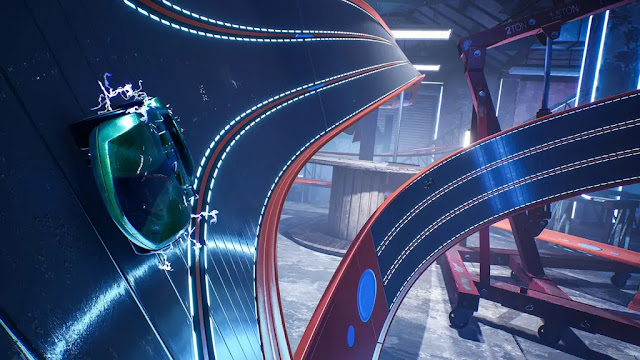
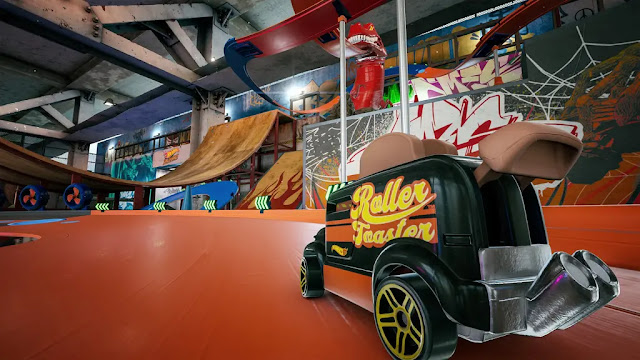
First and foremost – it’s the aesthetic for me. Having been born in the 70’s, playing with toy cars in a variety of bigger-than-life racetracks predates my love of video games, Hot Wheels Unleashed tickled my nostalgia in a unique way. Instead of blocky, retro graphics doing the trick, the visuals are instead bringing my childhood memories into sharp focus. For starters, there is a massive collection of cars here, and they get presented with fantastic, detailed models. Before you acquire them, they sit in their traditional cardboard backed, plastic-covered packaging that you used to see in the stores when they were hanging on wire racks in the toy department. It’s a simple aesthetic before opening one, but still pretty cool.

However, it’s the variety and design that takes center stage here. You have traditional cars, but you have plenty of other IPs in there as well, from Snoopy on top of a car or Batman represented. This sets the developer up with an opportunity to release plenty of DLC here as well, going forward. This is more than just visual flare however, as the cars have the specific stats we have come to expect from racing games. Acceleration, top-end speed and handling vary from car to car. One interesting twist is the boost meter, which can handle a bit different from one type of car to the next as well, from smaller, compartmentalized boosts to longer, single thrust slingshots that send you rocketing past the competition.

This ties into the two different kinds of resources in the game. One is coins, which is simple enough – you use it to buy blind packs or from a pool of rotating cars that you can purchase directly. This kind of blind pack system could be frustrating at first glance, because there’s no duplication protection and the first time I drew a duplicate I sighed. Then I quickly discovered I could sell the duplicate and it was just about the same price as a new blind pack, so I jumped right in and pulled something new moments later. The other resource are parts / gears that go into upgrading your cars. You can take a common car and upgrade it to a rare one and further upgrade it again if you save up enough parts. Early on, I had one that I liked well enough to invest in and get really good with, but the more I played Hot Wheels Unleashed, the more cars I unlocked and the more I found myself upgrading multiple vehicles to see how they turn out and play compared to one another.

All of this works only because the core gameplay is so tight. I was surprised to find I was not terribly good at Hot Wheels Unleashed initially. Not because I’m great at racing games – I’m really not. But I got my tail kicked in the tutorial, which is not how that usually goes. There are different difficulty settings, which was a big help to me early on as I learned the nuances of the controls. There’s little things, like how drifting into corners can help more rapidly replenish your boost, that you need to learn to take advantage of in order to come out on top. Track familiarity is helpful as well. First time through there was almost always one little thing that would surprise me, such as a key jump or a sliding turn that took me off of the path just a bit more than expected, that I had to learn. Additionally, the difficulty only really impacts the opposing cars, which is great in the races / nodes / objectives that have you going up against nearly a dozen opponents – but it doesn’t help a lick if your racing skills aren’t quite up to snuff and you are struggling with time attack nodes in the campaign.

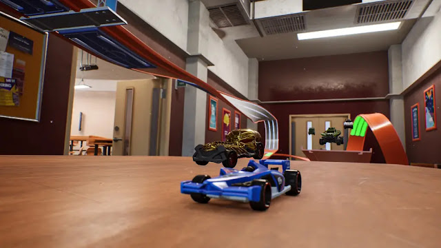
The track design is arguably the best element of the game, but it kind of ties into my above statement about needing to learn the tracks. It’s one thing to see the track layout in the corner of the screen, similar to most racing games. But there’s a few extra elements that you can’t always anticipate for by looking at that, and often times these are involving sharp turns which doesn’t give you a lot of visual warning either. If you don’t make a jump going fast enough, you’ll miss the landing point on the other side of the gap and have to reset your car. There may be a section where you’re on a brown wooden floor with orange cones coming up that don’t really stand out much until you’re right on them and already turning – leading you to stray from the track. These little quirks are sometimes annoying in what is otherwise pretty fun track designs. They make use of a combination of things, such as magnetic tracks that allow you to go vertical or through large loops like the old school tracks of my youth, but also span tabletops, have household items as part of the visual environment that just add a bit of flare to everything.

Aside from getting new cars, you can also unlock new items in the area called the Basement. This is one of a half dozen other zones (such as a skate park or a garage), but the basement is probably the coolest for two reasons. One, it’s the most like my childhood in terms of nostalgia. Additionally, you can edit the basement, adding things like different items for the shelf, different colors and patterns on the walls, ceilings and floors, things like that. You don’t get to make any changes to the actual race course, but it’s still a neat feature that I’d love to see added to the other locales later. Also, given the action’s intensity? I found it difficult to take in the environments unless I was having someone else race and I was spectating. It’s dangerous to let your eyes drift off of the track for too long. In terms of the camera view, I could see this being an issue for some people as well. I prefer the angle used here – behind the car is my default in pretty much all racing games. But I can see some people feeling it’s a missed opportunity to see the dash or even take on the action from a first-person perspective not offered here.

Last but not least, there’s several modes here to keep you coming back for more. You can do quick races, online matches and the other normal modes – but there’s a bit of a more involved campaign mode that has you doing ‘boss battles’, different kinds of races (timed, competitive position, etc) that unlock nodes on the map with each successive victory. Each victory also tosses you things like gears, coins and blind packs, further adding to your stock of cars. It’s all a very rewarding system of progression, constantly dangling that carrot while the game itself really lends itself to that addictive “Just one more race” mentality. Lastly, for those with a creative itch out there to scratch, the Track Builder mode is pretty robust and you can share them out online, giving Hot Wheels Unleashed the kind of limitless potential that could keep gamers rallied around this game for a long time. Now, you don’t have access to all of the ‘parts’ right away, as you’ll have to earn them – but these are not core components. Just extra bits of flare that can be tacked on later.

Summary

Hot Wheels Unleashed is a fantastic and thoroughly enjoyable arcade racer that brings my childhood imagination to the big screen in thrilling fashion. The visuals are fantastic, there’s plenty of modes and some pretty solid progression elements that kept me coming back for more.

Score: 9 / 10


Share:

Soul Nomad & the World Eaters - PC Review


Soul Nomad & the World Eaters
developed by Nippon Ichi Software, codeglue and published by  NIS America Inc.PC review by Richard with a copy provided by the publisher.

 Estimated reading time: 11 minutes


Soul Nomad and the World Eaters is a classic NIS title that really hits home to my nostalgia. One of the NIS titles that shows a bit of a darker foray into the storytelling zone, and a title I put 80+ hours into back in the day. Now no longer only a PS2 title released back in 2007, Soul Nomad is now available for PC. Has it held up well, or have the ravages of time crushed what was a really intriguing title? It's time to find out.

First thing first before we get into the gameplay, at the time of writing this review there are some…technical issues with the title on PC. Some people have an issue where the screen shows black on start-up, but you can still interact with the game, see the cursor, and hear the audio. There are workarounds available on the Steam discussion page, so hopefully those work for most people. Unfortunately, apparently I don't fall into this category. It took about 6 hours, and me having to get a friend to log into my account, boot up the game, change the config options to a working resolution, and then my friend had to send me the config file.

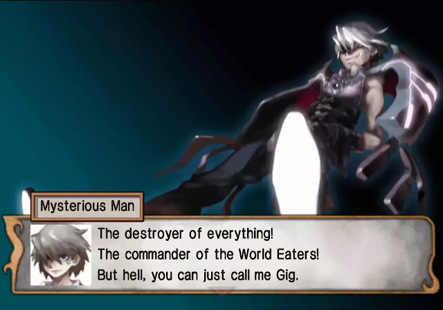
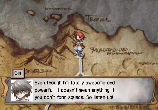
So what about the game itself? Well, in Soul Nomad we delve into a world ravaged by giant monsters called "World Eaters", led by a man named Gig, the Master of Death. After a great battle, Gig is defeated, but the World Eaters remain, albeit in a dormant state. After 200 years, the protagonist is adopted into a hidden village, and tasked with being a protector. The leader of the village elects the protagonist to finish the job of their forefathers, and defeat the World Eaters so that the world will know peace once again. And so the protagonist is forced into a contract with the Master of Death himself, Gig, in a bid to try and use his powers to eliminate the World Eaters without succumbing to his influence.

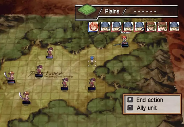
If you've played a grid based tactic title before, you'll have a good basis for how Soul Nomad works. You have a world map that travel around, and you visit key locations of interest to progress the story and get into fights. In fights you have the power to summon units at the cost of "Gig points", and command them following a turn order on a grid. The grid has different tiles that will affect your units, perhaps increasing evasion or defense. If you get close enough to an enemy unit and attack, your whole squad goes in with you.

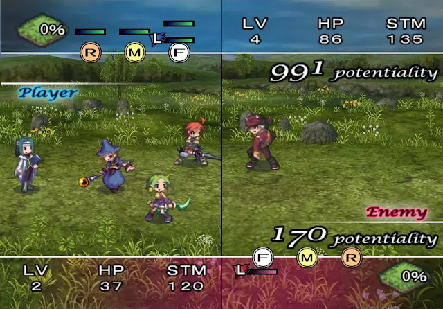
That's right, you get a whole squad. Each "unit" actually comprises multiple individuals in a "room" that can provide different bonuses. These squads act together when in combat and will all take their actions together. After taking action, the opponent has an opportunity to counter attack. Each squad will have a leader that inherits a portion of the stats of the other members as well, although if a leader is defeated, the squad will be considered defeated as well.

In addition to basic combat, squads also have a stamina bar that will decrease when performing actions such as moving or attacking. If the stamina gauge is is below 80% you can use special moves based on the units in your squad. But be careful, because as your stamina decreases, so do your stats. You also have the option to use "tactics" or "Gig Edicts" on the battle field map, which are skills and items respectively. Skills will replace taking an action, such as attacking, but can give a buff, a debuff, or cast a spell at an enemy, as examples. These tactics gain exp when used, and can level up, but have a limited amount of uses per battle.

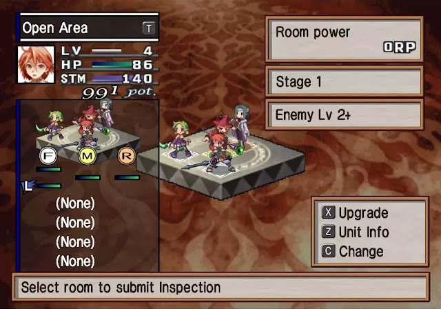
So how do you set up a squad? Well, first thing is you need a room for them. Rooms can be swapped out, or locked in place to keep the rooms you want from changing, but are pretty random in terms of what you get. Each room consists of a 3x3 grid, with a front, middle, and rear setting. Not all of these positions may be available though, as you could get a room with only two middle and two rear positions, or you could get a room with a lot more open slots. Once you have a room you like, you can then purchase and assign units to that room. The abilities and moves a unit can perform are based on their location in the room. As an example, putting a swordsman in the front will have a melee combo, but putting them in the middle will have them shoot out a shockwave. As you progress through the game, you will also learn about décor items that come with the rooms, and how you can upgrade them.

Room inspection is Soul Nomad's version of the item world from Disgaea, where you can jump into a room, and fight your way through levels in order to upgrade the effects and the room. While in a room inspection, summoning squads doesn't cost points, and clearing floors will improve your room. Now, the game mentions this as a sort of throw away line, but is pretty much the only way you're going to be able to grind exp and points, so think about popping in once every so often, even if it's in a room you aren't using, just to get some exp.

Now, one of the major reasons I liked Soul Nomad as a kid was because of the Demon Path, which is an alternate "evil" side to the story you can unlock after clearing the game. It was also the first time I had seen the trope for "even evil has standards", and hoo boy, was that an experience. There are a bunch of different dialogue options presented to you throughout the game, and answering differently may lead to alternate endings, which is a pretty fun facet.

Now, while the music is still quite good, let's be honest about the graphics: they're dated. Apart from a little text refurbishing, everything is just as it was back in the day, for better or for worse. Unfortunately this means you still get the old PS2 early days graphics, just stretched to fit your monitor, if it happens to be larger than your TV was back in the day. Thankfully, while the graphics may have aged like a miscellany of cheese, the gameplay has aged like wine.

There's a lot going on in Soul Nomad, from the squad match-up bonuses, to the stat distribution, to some really weird units that have some pretty funky attacks. Tactics that change based on squad composition, combo moves available between units of specific types, and janky squad builds that work surprisingly well, there's a lot more depth to Soul Nomad than it lets on. While you don't need to know, or remember, a lot of these functions, as I cleared the game with minimal delving into the mechanics the first time I played, doing so will add a whole new level of gameplay. Couple this with the fact you can beat up random citizens for stuff, and Soul Nomad was certainly ambitious in all the right ways.

Summary

Overall, I have to say I still love Soul Nomad and the World Eaters, even more than ten years later. The gameplay is still really fun, the storyline is great, and I love all the little aspects that come together to make Soul Nomad what it is. That being said, there is no graphical update, and the "black screen of death" that you may experience on start-up may put newer players off. As with most retro titles, Soul Nomad doesn't pull its punches either. It's tough, and it isn't afraid to let you know it. All-in-all, a patch to solve the blackscreen issue would do wonders, and while I wish there were an update to the graphics, everything about this title I loved is still there.

Score: 7.5 / 10


Share:

The Walking Dead: Saints & Sinners - Aftershocks - PC / VR Preview


The Walking Dead: Saints & Sinners
- Aftershocks by developer and publisher Skydance InteractivePC preview written by Pierre-Yves with a copy provided by the publisher.

Estimated reading time: 4 minutes


With an incredible virtual reality journey behind me with Skydance Interactive's The Walking Dead: Saints & Sinners, yesterday marked the launch of the latest addition to this experience, Aftershocks. While once trying to survive a fairly "calm" environment with walkers roaming around after your journey has ended, new supplies from The Reserve have washed up and everyone who couldn't get their hands on them before are now out in droves to rectify previous shortcomings.

Now, originally after having fought through in order to get to the reserve, taking what you possibly could and then heading back “home” to your bus, after a few days of quiet the radio if set to channel 47 in going to start to play different messages than the ones you would have previously been hearing.

Now, instead of just being told where the hordes could or could not be at certain times of the day or where small caches of meds and food could be found, you’re now going to get messages telling you where new caches have popped up and what kind of a time you’re in for if you want them for yourself. In the hands of either the Reclaimed or the Tower, one thing is for sure, they are both out for your blood so shooting first and looting later will generally be your best option unless you’re REALLY good at sneaking around.

In my excitement last month, I thought that I was getting to see new stuff early and could bring you a preview of the content before Nick’s full PlayStation VR review, but instead, I got to see what was already there which was fun in its own right. Didn’t get to fully update your crafting tables? Didn’t unlock everything you could between your melee, ranged and medical items? You were given a chance to top off these items on your list at your pace with ideas of where small caches could be found alongside some death squads of Reclaimed or of the Tower could be found.

I’m actually happy that it wasn’t the Aftershocks if only because I had been worried before of not having a comparison and now I do. So for the Aftershocks, this obviously happens once you have completed the main campaign and honestly the additions are pretty impressive especially for free DLC that has been made available for both the PC and the PlayStation simultaneously. Now, while still getting new updates through channel 47, your quest log will update with a path to follow in order to get your hands on “the goods”.

After having gone through a few of these quests, I was happy to see that they didn’t all follow the same format but instead kept enhancing the experience with some new challenges. Set in the same locations as before, the dead have continued to increase in number, the available resources have continued to dwindle and the humans left are really unhappy to see your face. If they can see your face. So for these scenarios, you are given an idea of where to look and once you’re there you’ll have to adjust accordingly.

Video source: PlayStation Blog

For these new caches that contain a stupid amount of supplies, how you open them will all depend on the scenario that you find yourself in. Some may be locked by a key in the hands of someone else that you need to hunt down. Others can have already been opened and the supplies “are in another castle” making you relate very much to the famous plumber searching for his princess. Others, others have been brought into a location that is just creepy to search for it making you wonder what’s worse, the zombies / walkers prowling around in the dark or the trip wires that aren’t attached to cans but to propane tanks that will kill you faster than you know what happened as the game over screen comes up.

Now for the caches themselves, just wow. I didn't think I could think of anything really in the vein as a kid on Christmas morning but holy crap was there a lot of stuff packed into those containers. Ammo. Food. Medication. Ammo. Resource boxes. Weapons. Ammo. Did I say ammo? Seriously, getting your hands on over two-hundred shotgun shells makes you slightly reconsider for a while just how stealthy you really want to be. I quite literally brought on the pain after that one.

Summary

Now, not to not spoil everything that could be found in this brand new update, as I’ll leave some secrets to be discovered for yourselves, I will say that Aftershocks is a good reason to head back into The Walking Dead: Saints & Sinners especially since the update is free. For a game already this well crafted? It doesn’t get better than that!

Score: N/A


Share:

Sherlock Holmes Chapter One - PC Preview


Sherlock Holmes Chapter One
by developer and publisher FrogwaresPC preview written by Susan N. with a copy provided by the publisher.

Estimated reading time: 6 minutes


Sherlock Holmes Chapter One is an action-adventure game where players get to dazzle people with their famous deductive skills. As expected, we get to play Sherlock at a time when he hasn't yet developed his crime-solving capabilities. Make no mistake though, Sherlock Holmes does not hold players' hands as they must put the pieces of every puzzle together themselves. This is achieved through a number of different means and I'm 100% in love with this title already.

General Impressions

Right from the get-go, Sherlock travels to Cordona by boat - a method of travel he is not terribly thrilled about - to resolve previously unaddressed issues. Upon arrival, he relaxes in the restaurant of a fancy hotel. It is then that he stumbles upon a terrible and suspicious crime that requires solving. At first, Sherlock uses common sense and logic to dissuade the stranger from requesting his assistance. But, due to boredom and a small nudge from someone he knows, Sherlock agrees to help.

As a player that enjoys solving mysteries, Sherlock Holmes is the perfect sort of game to get lost in. It has intrigue and class, and it scratches an itch that is uncommon in games. Titles like Obduction, Return of Obra Dinn, Talos Principle, and Antichamber are some of my favorites in the genre is because they require observation and deduction. They are open-world games that allow players to stumble around for clues. And Sherlock Holmes Chapter One now fills me with the same sense of fascination that I enjoy in mystery/puzzle games. The reason for that is because Sherlock Holmes Chapter One shows players a different perspective of the highly regarded character because the game is set in his younger years before he became known.

Personally, I absolutely adore a good mystery, and the fact that the game requires players to use every available tool without holding one's hand is amazing. I also applaud the fact that Frogwares included a somewhat unique combat system that fits Sherlock's character. But make no mistake, this game is not easy. It will take wits and perception, requiring players to look around for the next clues. Being Sherlock requires a lot of leg work and the use of various tools to solve his cases.

Crime Solving

Sherlock Holmes Chapter One has a number of tools that help to solve cases. We have a case book that shows us the cases we've begun or have been completed. We also use various disguises which help us to gather information from suspects or witnesses. There is a neat concentration ability where players can visually see what likely happened based on the information gathered. And using that same ability, players can track witnesses and suspects to their whereabouts.

One of the most useful tools is Sherlock's mind palace where bits of evidence are listed in a text-based grid. These clues can be pieced together which helps deduce the culprits. What's neat about this point is that players will always be able to find information for multiple suspects. Just because there is an abundance of evidence to indicate one possibility, doesn't make it the right one. It is up to the player to figure out which suspect is the criminal.

Sometimes solving crimes takes a good old-fashioned map. When in doubt, players can consult the map of Cordona to find areas they haven't been or areas with clues to other crimes. I've already stumbled onto a case that requires the use of a map to find an item. And if players are unable to find their next location, they are free to solve other cases until more information is learned.

Finally, Sherlock is accompanied by his friend Jonathan who will occasionally hint at an idea to nudge the player in the right direction. If the player isn't having any luck or seems to be randomly talking to people, Jon will chide you about it. I find this to be a great feature of the game!

Combat

Sherlock Holmes Chapter One has a nice combat system that can be skipped if they want to focus on the investigative nature of the game. At first, I actually enjoyed the combat system because it isn't complex. In this game, players must use the environment to their advantage. Players can blind or stagger their aggressors before arresting them. And I love this idea.

There is a downside to the combat system though. Sherlock Holmes Chapter One is based around a unique QTE system that I don't know if I like. See, with most QTE systems, I find them to be uninspiring and frustrating because they require quick reflexes. In this title, not only do players need to be quick with their button presses, but they first have to use their mouse to trigger it. For example, the screen might show an icon to move your mouse to the left. Once you do this, then you will have to spam the 'A' key. It is intuitive in design because this doesn't require players to press unreasonable combinations, but I have never liked QTE systems.

The strange thing is that even though I am not a fan of the QTE element, I think that Frogwares did well with the design because it is unique! While I may dislike the system, it's not rapid button mashing. Plus, players can choose to skip the combat, which is a feature I absolutely adore!

Elementary Summary My Dear Watson

I would be doing readers a disservice to go more into detail about my gameplay experience because I believe it is best experienced by fans of this genre. Like Sherlock, it should be played free from the bias of a game reviewer like myself.

Sherlock Holmes Chapter One is top contender as my Game of the Year of 2021. The game is simply a spectacular, interesting, and mind boggling experience that fans are going to love. The game has me in its grips and I've spent every free moment playing it because it's enthralling. I cannot wait until Sherlock Holmes Chapter One releases on Steam in November because it's a treat! (And just in time for my birthday too!) In short, pre-order this game right now!

Score: N/A


Share:

Dice Legacy - Switch Review


Dice Legacy
by developer DESTINYbit and publishers RavenscourtNintendo Switch review written by Hayden with a copy provided by the publisher.

Estimated reading time: 9 minutes


When I started up Dice Legacy with a long history of city builders and colony management games behind me, I thought I was in for another rehash of the same old tropes – build some structures, grow your population, research everything you can, and play the micromanagement game in balancing production to consumption. It quickly became apparent that while those elements are perhaps unavoidably present, Dice Legacy has put a unique and memorable spin on them that kept me off balance and rendered previous experience with city builders irrelevant. There are two elements that Dice Legacy brings us that really stand out from the crowd and make this a game worth buying: action control via dice, and a world that feels reminiscent of a 2d side-scroller while maintaining 3d-like artwork.

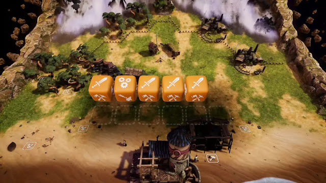
In Dice Legacy, the population is represented by classic six-sided dice, each face of which enables it to perform a given type of task. Icons for construction, harvesting, combat, exploration, research and others vary in their type and frequency depending on what type of citizens you have, and only the “top” face when the rolled is usable. The player seems to be hard limited to a maximum of 12 dice in their available-for-assignment tray at a given time, although it is possible to have a greater population than this if you can react fast enough that only 12 are awaiting reassignment at any given moment. React too slowly, and any dice past 12 that try to return to the tray are irrevocably lost – potentially a pricey mistake as higher-tier dice can represent a significant investment.

If the dice faces simply allowed the player to assign that die permanently to a job, we would be back near classic city-builder territory, but here in Dice Legacy these assignments only last for a single action/production cycle. After being used, the die returns to the assignment tray and must be rerolled before it can be used again. The result of this is a situation where the player can’t really plan far ahead – if you need more food or lumber or stone to do something, you just have to hope that your next roll gives you the die faces you need to perform those actions. If you don’t get them, you’ll need to either change your plans on the fly and do whatever you can with what you did get, or reroll your dice – but every reroll brings the dice a step closer to death, so spamming rerolls to get a particular face brings risks and challenges of its own!

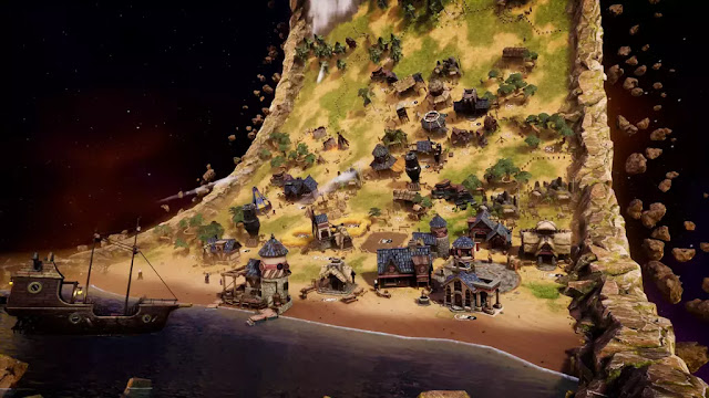
The second element that Dice Legacy uses to stand out from the crowd is a world that feels in many respects like a 2d side-scroller. The world map is formed like a ring, with the playing space being on the inside face. Width is quite limited, so you’ll constantly be scrolling “up” and “down” to move through your city, expand your borders and react to the events that the game frequently tosses your way. From bandit invasions that require specific combat-faced dice to repel, to freezing temperature, sickness and unhappiness that you favored one die type over another, Dice Legacy doesn’t really give you time to rest.

Did I mention that this city builder is very RTS-styled? Every action in Dice Legacy takes a certain amount of time – usually less than a minute, and often less than 30 seconds. Events have timers as well, and if the player doesn’t react in time – with the correct die-face action – there can be repercussions like lost resources or destroyed buildings. At the outset of the game when the player is handling only half a dozen dice in a limited area, this feels easily manageable and there are enough times when all the dice are assigned that you can free a hand to grab a drink. By the time you’re an hour into the game with a full tray of twelve dice, the pace feels anything but relaxed as you struggle to keep all the dice working across an expanding city area while bouncing between events that beset your borders!

Visually, Dice Legacy has made good use of contrasting colors and simple, clear iconography that makes the user interface easy to understand, even when playing on the small screen of the Nintendo Switch when used as a handheld. The buildings are visually distinct enough from each other that the player can quickly learn which is which, and there are button reminders on all UI elements in case you forget what does what. If there is a downside here, it is that in making the UI large and clear it can at times feel like it has taken up too much of the play area. Tooltips pop up every time the cursor passes over one of your buildings, and between the UI scale and the size of the tooltips I felt like I was fighting to see what I was doing at times, especially as the city developed and I had multiple buildings in close proximity to each other. While an option to adjust the UI scale manually (or an automatic adjustment when docked) would probably resolve the issue, this wasn’t listed in the game menus on the Nintendo Switch client at review time.

Sound design in the game is also very nicely done, and woven so well into the experience that it simply becomes part of the play experience. Music and the ambient soundscape blend pretty seamlessly, and have enough variety that you won’t find yourself hearing the same few musical phrases over and over. That said, if you’re a fan of hearing catchphrases or humorous reactions when you repeatedly click on your minions, you won’t find it here.

Summary

Overall, Dice Legacy is a very fresh and creative entry in a genre that can often feel like every game is just a reskin of another. The use of dice to randomize the actions available and the steady pace of external events changes this from a game of long-term strategy to one of improvisation and reaction. Clean, visually appealing art style wars with a slightly too large UI scale that can obscure much of the play area. Great for people who like to think on their feet and maintain a decent rate of action and excitement for extended periods. Not an at-your-own pace city builder like Cities: Skylines or other descendants of SimCities, however, so look elsewhere if you’re after a quiet, relaxing time.

Score: 8.5 / 10


Share:

Monster Harvest - Switch Review


Monster Harvest
by developer Maple Powered Games and publisher Merge GamesNintendo Switch Review written by Susan N. with a copy provided by the publisher.

Estimated reading time: 9 minutes


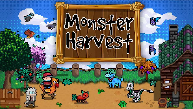
Monster Harvest is a farming simulator that combines elements of the typical simulator we all know and love with a turn-based monster fighting game. It appears to be a fantastic addition to the genre but ends up being extremely disappointing. Our review will cover everything from gameplay to combat to the graphics and UI.

Gameplay

Monster Harvest, the next great farming simulator game is out on Nintendo Switch and it isn’t great. We begin our journey like any farming sim. We are contacted by our estranged uncle who needs our help taking care of the neglected family farm. Of course, our character is accustomed to the big city lifestyle that has become dull and boring, so we take him up on the offer.

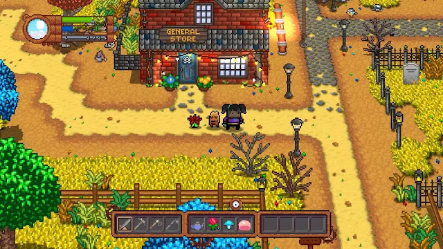
In Monster Harvest, the locations of the buildings are preset, unlike other games where there is customization. Right off the bat, this feels like a conscious choice to show the building options as well as the supplies required to upgrade. In games like Stardew Valley, players have to go to the upgrade vendor across town to find out what is needed. In that way, Monster Harvest is off to a good start. Players also discover that to the right of our house is a barn of sorts which houses your planimals.

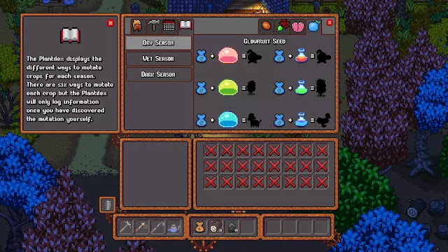
In the beginning conversation, which is about 95% of the whole ‘story’ of the game, we learn that SlimeCo is the great evil (read: JoJo mart). Monstrous slimes are on the loose! It becomes apparent that this is a unique aspect of Monster Harvest. Your uncle, the mad scientist, has found a way to harvest the slime power to create what is known as ‘planimals’. At first, this seems like a refreshing and cool concept because players can grow all kinds of creatures from their crops, but soon it becomes lackluster.

Furthermore, the game would have a cool concept if it was executed well. See, crops are used for everything like profit generation, evolving planimals, and stamina replenishment. At the beginning of the game, making a profit is the best option before worrying about the other elements. And while this creates an interesting crop economy management situation, it is frustrating because there are short-term and long-term problems with its design. In the short term, players decide which crops will become planimals, which crops will be sold, and which crops will be reserved for food. The long-term issue is that players need to have a stash of crops for consumption. The reason is that there is no way to replenish stamina other than by sleeping and eating food. Normally this isn’t a problem, but it feels like the stamina bar isn’t large enough - a point I’ll get into a little later.

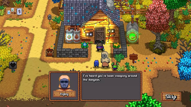
The townsfolk are rather bland and don’t have a new dialogue with every interaction. Yep. That’s right. The people have about as much substance as cardboard. Plus, pursuing relationships aren’t worthwhile as there is no reason to try. Yet for some reason players can gift the citizens items without being reciprocated with cool story beats or dialogue.

There is no passage of time in the game. Normally this isn’t a problem as it allows players to focus on farming, building, and exploring the dungeon, but it means that there’s little incentive to do much after clearing the farm of supplies. And about that dungeon, it is procedurally generated and only has five levels or rooms. It can only be entered at night time and only if you have a planimal.

And on that note, let’s talk about the combat in this game.

Combat

Combat in Monster Harvest is the most refreshing concept and also the most poorly executed. The first thing to note is that dungeon-delving can only be done at night time. It isn’t reliant on a player’s stamina nor abilities because the combat is done through a turn-based battle system. You fight the monsters with your planimals, which is great, but they only have a total of three abilities. What’s even worse is that none of those abilities include a heal. And to tack onto that idea, there isn’t even ‘planimal food’ to heal them. The only ways to heal are by sleeping (which also heals the planimals) or when the planimals level up.

But the disappointing part of the combat doesn’t only boil down to those aspects. The real killer is that even though there are only five procedurally generated rooms in the dungeon, if your planimal fights more than one creature in a row, they will likely die. If the planimal dies, then players need to use another one, which likely starts at level one - so you lose all the progress you’ve made. This is more disappointing because there is no option to retreat from a combat scenario and you cannot heal the planimals between fights either!

If those factors weren’t enough to convince players that the combat is terrible, then I have one final point to make about the combat system. Players can house several different types of planimals on their farm, but they can only use the primary one in the dungeon. The other planimals don’t matter and this leaves players with the sense that the combat isn’t really important. And considering players only start with one damage ability, this combat system is likely the worst that I’ve encountered in this style of game.

Graphics and UI

For all the mudslinging I’ve done thus far, the graphics aren’t that bad. I like the aesthetics created by the pixelated design. There are certain aspects of the graphics that are quite cool, including the fact that the male and female character models are a little more refined than some of the other farming simulators out there. That said, while I like the graphics overall, it was hard to tell when the crops were ready to be harvested.

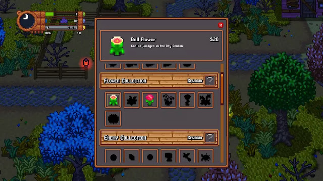
My biggest gripe about Monster Harvest is the terrible UI design, especially considering that this is a Nintendo Switch game. In each menu, there are multiple tabs that provide useful information, but somehow this showcases how unintuitive the UI is. Plus, there is no explanation about the control scheme nor the different concepts in the game. While I know that many compare Monster Harvest to Stardew Valley, in the latter game I can use a controller without issue. Part of the reason is due to the simplistic UI and design. In Monster Harvest it is not. Plus, if you combine the Joy-Con™ drift issue into the equation, this game is challenging to play no matter what your expectations are.

And since we are talking about different aspects of the UI, I can honestly say that this game should not have launched to the Nintendo Switch without a better text font or menu options. I played on a TV and I had a hard time reading the text. I can’t even imagine what that would look like in handheld mode. There aren’t even options to alter the UI size either, which doesn’t help provide accessibility to players.

Pros and Cons

With the combat issues, bland characters, terrible UI, small text, and lack of story, I had hoped that something about Monster Harvest was well executed. But, the more I played, the less I liked. In the end, all of these issues became the final nails in the coffin. However, I do have a list of pros and cons for players that are on the fence.

Pros:

     The game has a nice music loop. It’s soothing, if not repetitive.

     Monster Harvest as an interesting mix of game genres.

     The core game concept is cool. Not only do players use crops to generate profit, but adding slime to the crops turns them into planimals. They can regain stamina by eating crops.

     Planimals fight for you, meaning you don’t have to worry about stat upgrades, gear, or losing equipment like an RPG.

     Players might be happy with the fact that there is no time limit to tasks. The clock is mostly for show because the time passage doesn’t occur until players go to bed.

     Players regain stamina by sleeping or consuming their crops.

     Monster Harvest is a relaxing experience. There is little penalty for losing a planimal.

     Cute title suitable for all ages.

     Inexpensive title to purchase.

Cons:

     There is no map.

     The game has no rebinding of keys option or UI customization.

     There is no tutorial or full story. In fact most of what you need to know is said at the very beginning. Since the game has no progression, it is uninspiring at best.

     It's not readily apparent when crops are done their growth cycle.

     It's very hard to read the text, especially on the Switch. This is partly due to the text size but also due to the font choice.

     Monster Harvest doesn't have a clear indicator that there are options to buy individual items. I accidentally bought too much product because there is no tutorial or explanation.

     There is no option to sell at the general store! Players are only able to purchase products there.

     During combat, there is no option to retreat! Considering how difficult it is to heal, this concept is a key addition.

     Players cannot heal their planimals in between combat sections except by way of leveling up or sleeping.

     The stamina total is quite low for an infinite daytime cycle or the regeneration of stamina is too low. Players don’t get a lot of bang for their buck. Why bother having an infinite day cycle if there isn’t anything to do?

Monstrous Summary

Overall the idea of Monster Harvest was a great idea, but sadly lacks many elements that make the genre fun. Players are accustomed to building relationships with the townsfolk through gifting, which is an element in the game but there’s no real progression with it. Monster Harvest also lacks the freedom of placing buildings on their farm. Each building has pre-designated locations. And while I love the idea of growing your own fighting pets, Monster Harvest requires a lot more substance to be rated higher than I’m giving it in this review.

If Monster Harvest had invested some more time in any of the major aspects of the game, like the combat system, the relationships, or the story loop, the other issues might have been forgiven. Since I found myself bored with the gameplay and confused about my purpose in Monster Harvest, I can’t rate the game any higher than a 6 out of 10. There are too many missing elements for this game to really stand up to the other farming simulators on the market.

Score: 6 / 10


Share:

NBA 2K22 - PS5 Review


NBA 2K22
by developer Visual Concepts and publisher 2KSony PlayStation 5 review written by Nick with a copy provided by the publisher.

Estimated reading time: 13 minutes


A new year, a new sports game. Last year was a strange year for the world, and it was reflected in both the sporting and video game world. The good news is, just like in sports, every new year brings new hope and promise. By and large, NBA 2K22 capitalizes on that, delivering a robust, entertaining brand of basketball that may well be my favorite in the series over the last few years.

As I mentioned, 2021 was an odd year, and it hurt the NBA 2K21 franchise. Development teams were still trying to cope with the pandemic, three was a new generation of consoles coming out, and that led to a weird end result. NBA 2K21 on the prior generation of consoles felt underwhelming, and the comparatively later release of the game on the new generation of consoles combined with the weird real life schedule of the NBA season just made for a strange, jarring overall experience.

Let’s start with the overall framework of this year’s game. We are reviewing this for the PlayStation 5, and the hardware improvements feel better than ever. Games and scenes load with far more snap than the last generation, and while the 2K games have always had excellent presentations, the visuals in this year’s game continue to impress. The face scans are always just a little hit and miss as there are a ton of players to try and get right, but by and large they are plenty good, with players immediately recognizable. As a sport that doesn’t use helmets or face masks of any kind, and a lower number of players on the court when compared to other sports, that individuality is key to the visuals and NBA 2K22 gets it right the majority of the time.

Sure, there are still some odd collisions and moments out there with the graphics, but there are far more impressive ‘wow’ moments too. I recall one dunk in particular early on that I pulled off where there was mid-air contact, with the defender’s body hitting the deck and my player finishing with authority. It just looked and felt good. The one semi-consistent hiccup on the graphics front comes with wandering the city, where the framerate can dip pretty hard due to all of the players and activities taking place. It’s to be expected given the size of the City, but I find myself hoping that this gets polished up as the developers begin to make better use of the hardware in future years.

It helps that the haptic feedback on the PlayStation 5 just feels good in my hands and also seems a bit more refined than last season. The feedback through the triggers really brings full-bodied defense or collisions to the forefront. All of this is capped off with a strong soundtrack and the usual polish of the commentary. Certainly when you play a title like this as often as I do (I mean, you will play about 100 games in a season with playoffs and such), there will be repetition in the audio and even many of the player animations, but the whole things has an impressive layer of polish to it.

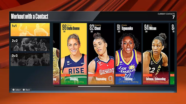
However, all of the bells and whistles in the world wouldn’t mean much if the gameplay itself doesn’t back it up. The usual bevy of modes are here with the card collecting MyTeam, another round of even more detailed WNBA options and of course the primary mode – MyCareer. This is where the 2K titles have been hanging their hat for years now, and the 2021 iteration continues to deliver on that front. It’s got plenty of lightweight RPG elements such as progressing your stats, making decisions and interacting with people. Last year on the new generation of consoles this mode introduced the City versus the prior, smaller neighborhoods of the prior generation of consoles. I do think there’s room to grow the WNBA options further, maybe even into a career mode that parallels the men but with a different set of options along the way.

The idea of the City was an interesting one last year, but it felt a bit rough around the edges. There were numerous things to do, but it still felt very empty at times and it was so large that getting around was rather cumbersome. But the potential was there, and dwhile I don’t think it’s completely realized yet in NBA 2K22, it’s a lot closer. I would appreciate more fast travel options (right now you simply have one – to zip back to your apartment), and if your internet is not strong it can lead to some frustration (I’m up at my cabin where my connection speeds can be a bit sketchy at times and there are certain events like skateboard races that can glitch our or outright disconnect you as a result), but the numerous quests and things to do certainly make the experience more interesting than last year. I do wish however, that quests were a bit cleaner.

Often you’re presented with two options to choose from, but it’s not always clear where those are at. You see two quest makers, but they don’t show up any differently on your screen. In one instance, I took the option I was not planning to, simply because I walked into the wrong building and it triggered that as my choice. But there was no indicator as to which person I was visiting before that. Either tagging the name of the person on the marker icons, or perhaps putting the distance you are in the upper left corner of the screen where your options were listed would provide some much-appreciated clarity on that front.

This all ties into the story in MyCareer as well. It feels considerably less linear, as you kick off with your best friend Ricky in your apartment and make decisions about your future. Sure, you can play your next college / G-League / NBA game or… you can go play some pick-up ball at a variety of different venues. Or you can go skateboard around the city doing timed trials or taking pictures. The way your character progresses is a bit different too, and ties into the story nicely as there is a great focus on a reality of our world today that many people either love or hate: social media.

Your story is less about some tough upbringing or living in your father’s shadow or standing up to your college coach, but more about how you and your best friend are also interested in being social influencers. Your character’s gotten popular via social media for their abilities, and it plus a successful high school career open the door to a variety of opportunities. You still earn VC (the virtual currency that is the backbone of the NBA 2K series, for better or for worse – as you use it for things like buying packs of cards in MyTeam or improving your stats in MyCareer. As one would expect, it’s a microtransaction currency that can be earned through gameplay – but also purchased as an accelerator) by playing games, and your play on the court enables you to unlock badges and other perks along the way, but your style of play trickles into some categories of your player as well.

Admittedly, I wish this was a bit better explained, but it feels like something that could be fleshed out in the years to come to really have an impact on things like conversations, or even on-court interactions with other players. There is some very cool RPG-like potential to this system, though currently it’s primary focus is a means of gatekeeping endorsement opportunities for things like shoe companies. Simply put: the progression was a lot of fun this year, though the grind is real for those who don’t want to spend real life money on VC.

The actual gameplay itself has gotten a kick in the pants this year too. I enjoyed the PS5 version of NBA 2K21, but the AI was incredibly sketchy at times – especially in pick and roll scenarios. I was easily abusing the AI time and time again. Shooting never quite felt right to me either. Also an over-reliance on sprinting had me in the old Madden mindset where you hold the sprint trigger far more often than I should have been. A lot of that is cleaned up this year.

For one, the AI is definitely peskier on defense. Also relying on sprinting too much has a notable impact on things like shot accuracy and your ability to handle the ball. This slows the pace down from last year’s game, but I am okay with it. I tend to lean towards two builds – a three point ace / slick passing point guard and a rugged defensive player with no shooting range but dunking ability for days around the rim. I’ve been building out these two archetypes for a few years now, and did so again this year. I would say that my athletic big man performs similarly to last year, but the gameplay for my point guard is certainly different and requires me to be more thoughtful and strategic than in recent memory. I was happy to see that some of the little tricks I had developed in years past that felt less authentic but more effective are subtly getting worked out of the game. 

Summary

NBA 2K22 is a successful return to form for the series. An extra year on the hardware has certainly helped, and the developers continue to blend lightweight RPG elements with action-packed basketball for an end result that I have sunk a ton of time into already, and will no doubt continue to play throughout the rest of the year. The focus is still on the Career mode, with minor tweaks to Franchise, WNBA and MyTeam, but that’s okay by me – MyCareer is where I’m usually at. There’s still room to improve, but this year’s iteration of the series is worth playing for hoops fans.

Score: 8.25 / 10


Share:

Random posts

Our Streamers

Susan "Jagtress" N.


S.M. Carrière

Louis aka Esefine

Aldren


Affiliates

JenEricDesigns – Coffee that ships to the US and Canada

JenEricDesigns – Coffee that ships to the US and Canada
Light, Medium and Dark Roast Coffee available.

Blog Archive

Labels