• Metal Slug Tactics - PC Review

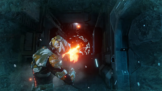
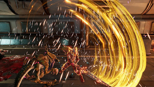
    The Metal Slug series has been around for a long time, and despite its age, the titles tend to stand the test of time. They have a fun, colorful visual style that ages gracefully...

  • Eden Crafters - PC Preview

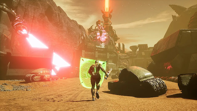
    In this open-world game you are challenged with turning a hostile planet into a habitable haven for all of human kind. You have the ability and equipment to temper the climate, and to create a breathable atmosphere!

  • Dungeon Inn - PC (Steam) Review

    Dungeon Inn is a cozy strategy management game that has an amusing story. The premise? Sara and her crew end up trifling with a scary dragon who catches them red-handed stealing from him.

  • Shadows are Alive - PC(Steam) Preview

    Shadows are Alive is an interesting sort of mash-up of a lot of fairly popular titles coming together to create a pretty solid premise. A weird mix of Player vs. Player, puzzle solving, and exploration...

  • V Rising 1.0 Reviewed by a few Vampires

    Come one! Come All! Listen as we regale you with details of a vampire game that fully released on May 8th with more content, bosses, and just loads of fun!

  • 9 R.I.P. - Switch Review

    Hey! Have you ever heard the ghost story about the "Bansh-Otome Ghost"? They say she roams web forums for victims. If you stay up too late...

  • Natsu-Mon: 20th Century Summer Kid

    Going into Natsu-Mon I wasn't sure what to expect. I watched the trailer and knew it was about a ten-year-old boy on summer vacation and from what I saw it looked like a mix of Harvest Moon and Animal Crossing...

  • 8-Bit Adventures 2 - PS4/5 Review

    8-Bit Adventures 2: The Adventures of Squishy, is finally here on consoles! Who's Squishy you ask? Squishy is your robot and totally the main protagonist.

  • Sea Power: Naval Combat in the Missile Age - PC Preview

    Placing you in command of either NATO or Warsaw Pact nations, Sea Power is an incredibly detailed simulation of modern naval combat and will test you every step of the way.

Salt and Sacrifice Review


Salt and Sacrifice
by developer Ska Studios, Devoured Studios and publisher Ska Studios—Sony PlayStation 4 review written by Richard with a copy provided by the publisher.

Estimated reading time: 7 minutes 


Sequel to Ska Studios' Salt and Sanctuary, newly released we are taking a look at Salt and Sacrifice, a title that takes from its predecessor with changes to mix things up. Will it hold up against the Souls-like/metroidvania of Sanctuary? Or has it Sacrificed what made the original so good? Well, it's time to take a look to find out.

If you've played Salt and Sanctuary, you'll probably have at least a basic idea of what you're getting yourself into. If not, well, honestly there have been a lot of changes to the formula, so you're not put too far behind the curve. You play as a nameless sinner, one who has been sentenced by the kingdom to atone for your crimes by getting rid of the Mages plaguing the kingdom. On your way to the location where the mages congregate, your…animal? gets attacked. Chances are, you end up dead. But no worries! You've been marked by a special ritual, allowing you to come back from death as many times as needed! Provided you do not succumb to the "Haze".

Salt and Sacrifice, like its predecessor, is a 2D souls-like with metroidvania elements. What this means for Sacrifice specifically, is that you will roam around an area in a 2D fashion, beating up on enemies, and they will drop salt which you can use to level. Combat is done based on a stamina system, where attacks, blocks, and dodge rolls consume stamina, and you need to regenerate it periodically. You also have access to a stock of consumables you can replenish at checkpoints, and if you die, you drop all your salt and need to go pick it up again before dying, otherwise it's gone for good. And yes, there is an equip burden that affects movement and dodge roll.

As you progress through the game you will also acquire tools to help traverse areas, such as a sort of hookshot you can pick up in the first area. Yes, there are specific areas now, as well as a main hub location, where you can craft items and purchase stuff from a vendor, before leaving to go explore the different biomes containing the Mages. Each new area is locked behind certain area bosses and Named Mages, which you will need to defeat before you can progress. The Named Mages come in different forms, and you are required to defeat a certain number in order to gain access to sealed doors you will find while exploring.

Now, if you've played any Souls game, you may be wondering why I'm making this distinction between "area bosses" and "Mages", despite Mages being functionally bosses. Well, Ska Studios decided to do something a little different this time around, and has introduced some Monster Hunter style elements. Basically, after beating a Named Mage, they will then appear randomly in the stage, and you can beat them to hopefully get more of their specific material drops. These materials can then be used to craft equipment based on that Mage. There are also "Pyre" items that are used as upgrade materials. These can be acquired from the Mages, or chests and item bags throughout the areas.

I'd like to take this moment to comment on a few things. First of all, I was about to write a pretty scathing review before the last patch. Luckily it got released the day before I started writing this review. Thankfully the patch solved a lot of my issues, but the basic feeling remains the same: it doesn't feel like some of the bosses/Mages/enemy design/placement were really play tested properly, if at all. I'll say this now, but I have completed the game, defeated all the Mages, and gotten the Platinum trophy, so I have successfully completed everything up to the New Game Plus run, and I can honestly say that some of the bosses and enemy placements made me want to just huck my controller out the window.

You can get juggled, you can get flinch locked, and enemies can shore up on the edges of platform, preventing you from climbing up or landing on the platform or knocking you off the platform, where you'll then fall 400 feet to your death. Also, if you're chasing a random Mage, their boss area can be right in the middle of a bunch of enemies, sometimes tougher enemies. While they will fight each other, it can be really frustrating sometimes. Also, there are some hitboxes that just aren't really fair if you're in melee range. Another annoyance is that enemies will follow you all the way to the bathroom given the opportunity.

One really interesting, but also possibly frustrating, aspect revolves around your consumable items, such as healing potions and thrown weapons. You can also gain access to other thrown items, such as poison vials and molotovs. You can craft on the go, but you need the associated materials to craft. Yes, you can run out by the way, so if you have no materials left for healing potions, you have no healing left. Thankfully, the materials are quite abundant, and you can also collect some in the main hub area, or purchase a bunch from the merchant.

If you're used to Salt and Sanctuary, the graphics are the same as always. The 2D hand drawn style art, combined with atmospheric music, produces a decent ambiance. The developers also know what you're looking for in new game plus, as the quality of the upgrade materials gets increased to reflect the new challenge rating, which is really nice. There are a few issues here and there, such as trying to return from some of the hookshot points just not working well, or when you go to kill a Mage you have to hit the circle button while the Mage is downed, otherwise they get back up after a while. Unfortunately, if the Mage is overtop of a tool you can use, you may find yourself activating the tool, or picking up an item, instead of killing the Mage.

Summary

Overall I did have a lot of fun with Salt and Sacrifice, although there were a few moments where it got rather frustrating. With the new change up to how the game plays out, I expect a lot of people to be upset with the new direction. It's not a bad direction, just new. I really appreciate the devs branching out in a new direction, and hope they continue to do so from now on.

Score: 8 / 10


Share:

My Time at Sandrock Early Access Review


My Time at Sandrock
by developer Pathea Games and publishers Pathea Games and PM StudiosPC (Steam) Early Access review written by Susan N. with a copy provided by the publisher.

At long last, the eagerly-awaited sequel of My Time at Portia comes My Time at Sandrock and I'm excited to finally review it. This game had a long and tumultuous delay due to licensing issues. Released in Early Access is the successor to My Time at Portia where I have sunk over 400 hours into. Sandrock like Portia is part of the Free Cities Alliance which explains the appearance of a particular character from the first game. It is a sandbox RPG game and life simulation, thus I was all over it. Plus, I think it rates really high for me.

Gameplay

My Time at Sandrock is a wonderful life sim and RPG game that begins with a novice builder answering the call to aid of the fledgling town. The notable first improvement of the game is the customization options in the character menu. Players are able to adjust the length of their hair and have several more options than in the previous game. I immediately went for purple hair because purple is the best color.

The second most notable change in Sandrock is the scenery. Unlike Portia where trees grow aplenty, in Sandrock it is bad practice to chop down trees. Immediately this strikes me as a game that wants to show the cause and effect of human interaction and the environment. Gameplay-wise, this requires players to rely on salvaging old broken-down vehicles and items for parts. So far, the game has a great message but it continues to improve throughout gameplay.

Like Portia before it, players are sent tasks to build various items that help the town prosper. As they fulfill these tasks, players can pick up additional jobs from the commerce board or from other characters. There is mine hunting, research disks to analyze, town meetings, and even pet interaction like we’ve come to expect, but each element has improved dramatically from the first game.


Quality of Life Changes

First, let’s talk about some of the quality of life changes that make Sandrock a massive improvement from its predecessor.

     After picking up missions, players often go to their crafting bench to make whatever item is needed. While this is an aspect available in Portia, Sandrock shows the items needed for commissions but also displays how many items you own and you can craft. This is true even if the items are in storage containers.

     The assembly station is critical for building a variety of items needed for the town. Sandrock has made building those items easier by giving players a cycle button, allowing us to switch to components that we already have. No more hunting for where components go!

     The combat is fairly basic but looks more satisfying. Players break an enemy’s bar to interrupt their attacks. And while on the topic of combat, players also have an innate healing ability making it easier to survive encounters.

     There are more character customization options than in the previous game and it looks better graphically.

     In the mines, the ore is separated from the ground and into nodes, making materials easier to obtain. Additionally, players don’t need to dig as far down in order to find artifact pieces or other materials. But that’s not all! Players are finally able to mine while the scanner is active! It even remains on for a bit of time before shutting off.

     Farming is better streamlined in Sandrock. Players get an all-in-one tool that shows all of your seeds, fertilizer, and water availability. 


There is plenty more quality of life changes in Sandrock that could be listed but this gives people an idea about the game improvements. Overall, these changes are excellent, particularly the assembly station material placement! I don’t know if I could ever go back to Portia because of this change alone!

Combat

The combat in Sandrock is not a blockbuster hit, but it is visually entertaining. Sandrock’s combat system is rather simplistic but flashy. The gameplay focuses more on the other aspects than it does on combat, but honestly, this doesn’t take away from my enjoyment of the game. Combat doesn’t need to be intense for a game to be a hit.

Regardless, players get to choose between a couple of different weapon types but fundamentally it doesn’t change the combat difficulty. That said, there is a skill tree where players allocate points to improve their maximum HP or increase the damage dealt by weapon type. Distributing points in specific weapon knowledge allows players to combo their attacks. Depending on the type of weapon, most of them give the ability to combo five hits on an enemy, which is oddly satisfying.


Workshop Maintenance

My Time at Sandrock adds a new element to the core gameplay loop which introduces building maintenance. Each machine still needs topping up with fuel, and also has to be regularly swept of sand. In the desert, players encounter strong sandstorms. To continue their work, players equip protective headgear. It also means that the crafting machines will clog up with sand particles. If the sand builds up too much, the machines will stop working. As such, players craft a feather duster to periodically wipe away the sand.

What also sets Sandrock apart from its predecessor is the requirement for water. The desert doesn’t have many water sources and the large pond in the town is the primary source of water. Machines that players use to craft objects require water to run, meaning they have to keep an eye on their consumption. Thankfully, crafting dew collectors is key to a builder's survival. Otherwise, purchase some at the water tower maintained by Burgess. The skill tree has available abilities like water conservation which also helps to conserve water!


Character Interaction and Story

Sandrock does a lot more than Portia did in terms of its story progression. It feels much faster because there is less downtime between story events. Where Portia’s mission to craft a bridge felt like it took forever to complete, Sandrock’s objectives seem easier to fulfill. Perhaps this is due to the ability to mine specific ore nodes which makes it simpler to stock up on materials. Or maybe I felt it was faster due to having the ability to get a basic supply shipment earlier in the game. It just felt like I didn’t *need* to run into the mines every day to collect materials.

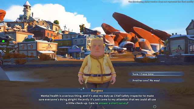
On top of the game’s cadence, I found that I related to and liked more of the townsfolk than I did in Portia. The Church of Light members care about their fellow townsfolk in Sandrock. For example, quite early in gameplay, Burgess visits your workshop to do a quick survey on your mental health. Adding this acknowledgment in a relaxing RPG game like Sandrock made me smile and I respected the Church of Light more.

But this wasn’t the only aspect of character engagement that hooked me into the story. I enjoyed listening to Cooper babble on about whatever was on his mind. Even the dialogue options let players tell him to get to the point or keep going. As a chatterbox myself, this character amused me because I was half expecting my character to pass out from boredom.

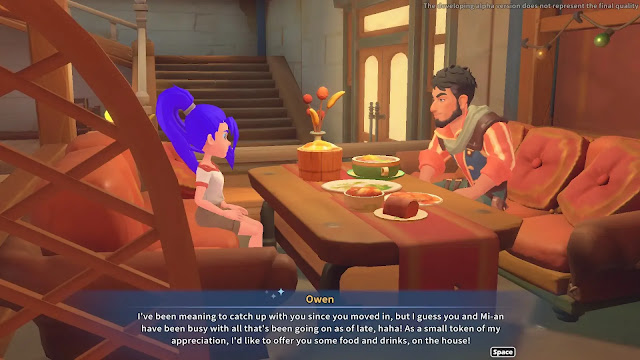
Another thing I love about the character interaction and story progression is the helpful rival. When you arrive in Sandrock, another person has also answered the call for aid. Mi-an is a fellow builder that is kind-spirited and rather friendly. Unlike what’s-his-face from Portia, the drive to complete commissions was more of a friendly rivalry as opposed to all on war. I didn’t really like the egotistical manner of that character from Portia. Mi-an is much more interesting. Players even assist her in a critical investigation later in the story, which also makes me feel like I'm a part of the town.

Mini-Games and Events

My Time at Sandrock has a number of unique mini-games and events that players experience. One of the first events that players can participate in is the experiments with Dr. Fang. On specific days, players can head over to the medical clinic and try one of Dr. Fang’s concoctions. Some of these experiments go well while others do not. I think my character ingested a minor poison at one point, but thankfully it didn’t affect much in the way of gameplay. Regardless, this event was amusing.

Later, we get to play wack-a-mole at the arcade with one of the townsfolk. Not only was this event fun, but participation in the event harkened back to the concept of mental health. All work and no play make for stressed individuals. This event isn’t a throwaway concept about how protecting one's mental health is key to a healthy life, but a reminder. In this way, I praise Sandrock for this inclusion. And if that isn’t enough, wait until you try Yakmel racing! I had too much fun with that event. Seriously.


Other Points

Early access titles are rife with issues. As such, I expect there would be minor grievances throughout my run of the game. Presumably, these will be rectified through the early access phase but here are some of the issues I encountered:

Minor Issues:

     When on horseback, the animal tends to get stuck at the top of the stairs. Horse-riding is quite smooth in Portia, so I hope this is rectified quickly.

     The longer you play the game, the more it loses stability. So, be sure to restart the game after a couple of hours. And remember to save often.

     Out in the desert, there were some rocks that were missing their textures. They appeared as 2D purple shapes.

     One of the missions doesn’t clearly show where to go. It displays the mine entrance, not the meetup point before arriving at the mine.

     Every now and then, a popup box or dialogue would appear with unreadable text. Usually, I would see a string of characters, presumably a dialect of Chinese. I’m hoping that all text displays in the proper language selected by the user in the future!

     Certain navigation aspects on the controller are not well optimized. While this isn’t game-breaking, controller navigation needs a bit of love. That said, playing Sandrock on keyboard and mouse is fantastic, so don’t hold this point against the game!

Final Thoughts About Sandrock

My Time At Sandrock is a much better game than its predecessor. I felt that I was much more invested in the story, the characters, and the events. Even though it felt like we were doing more to maintain our workshop, I didn’t feel bogged down with any aspect of the game. In fact, I love this game so much that I already have about 80 hours of playtime! The graphics are much cleaner, many gameplay aspects are greatly improved, and I’m much more invested in the world than I was with Portia. All we have to do is wait on the multiplayer feature and it'll be mostly perfect!

Summary

Fans of My Time At Portia need not look any further than purchasing My Time At Sandrock. This game builds upon a solid foundation and is much better for it. Special attention was paid to a vibrant and realistic world that is environmentally conscientious, includes diverse characters, and showcases positive mental health messaging.

Players familiar with the previous title will enjoy almost every aspect of Sandrock to a point where they will easily lose track of the time. Because Sandrock impressed me, even in the Early Access stage, it’s fair to say that it is game of the year material!

Score: 10 / 10


Share:

Dolmen Review

Dolmen by developer Massive Work Studio and publisher Prime MatterMicrosoft Xbox Series X|S review written by Pierre-Yves with a copy provided by the publisher.

Estimated reading time: 8 minutes 


Having originally taken a look at Massive Work Studio and Prime Matter’s Dolmen on the PC during the holiday break, this was one Soulslike that I've had on my mind since. Leaving behind the more medieval settings that so many have worked within, this adventure is all about how to survive in a non-dystopian science fiction format.


By this point in time I am definitely no stranger to a Soulslike. Demon's Souls, Dark Souls, Bloodborne, Elden Ring, The Surge 1 / 2, Salt and Sanctuary / Sacrifice, Ender Lilies, Stranger of Paradise: Final Fantasy Origin, and several others. Each of these titles, whether from From Software or others, whether I’ve gone through and platinumed on the PSN or not, have continued to build what is now an incredible genre that has begun spanning multiple others for some pretty crazy adventures.

So it's within these titles that you can both see the influences and the innovations which is what drew me to Dolmen. After receiving a distress call, you are sent to investigate a planet where the material known as a Dolmen is mined. Not only has tragedy fallen to those that worked here, the walls of reality have blended making everything a surprise for both you, and your navigator.

So it's here that I once again find myself but with both prior knowledge of the first stage ahead of me and the thirst to know what comes next. Paving some new ground in order to find out, Dolmen has your protagonist equipped with a Health bar, a Stamina bar and an Energy bar. While health is the obvious one of how many hits you can take, stamina is also fairly self explanatory being how much you can swing your weapons, run around or dodge various enemy attacks.

Energy though is where things got interesting. Channeling the science fiction elements, Dolmen allows for you to equip a variety of futuristic long range weapons such as pistols and rifles over to shotguns for some serious up close, yet still ranged, action. Each of these not only take varying costs of energy, but can also switch between temporary or permanent energy depending on the firing mode. Temporary energy will be restored after a time of not being used like your physical stamina. Permanent usage tends to carry a much higher impact but at the cost of having less overall energy to work with.

Moving into a more melee build, it’s also possible to equip yourself with an element of your choice and channel it into your attacks. Fire, Ice, Acid, these can be swapped between whenever you need to and will act as your primary element when you really need a boost. This boost uses temporary energy so there’s no reason not to use it. It makes the implemented energy system just as useful for melee builds as it does for ranged builds. Finally in regards to elements, not only do these do what you would expect such as fire burning and ice slowing you or others down, but they also add percentage based status effects such as fire also decreasing an enemy’s defense making it a favorite of mine.

Also keeping things interesting is that energy is also used to heal yourself by taking a portion of your permanent reserve. This can be done in quick succession if needed, but once it’s done, like your range weapons, that gauge will wind up pretty empty. So it’s a good thing that like other Soulslikes, you have a specific item that exists for this very situation. The only catch that comes with using this consumable is that it won’t restore your energy completely and it takes time in order to use it. So if you are planning on using it? Make sure you have the time as you often won’t in a boss fight!

Now here’s where I found myself at odds. On one hand, all of these ideas still felt as well thought out as they had back over the holidays when I first took a look. On the other hand, I found myself thinking back to Hellpoint where while the ideas were all there, the execution of these ideas at times had me wondering, is it just me or is it the system? Dolmen for lack of a better term “isn’t easy”. Enemies hit hard, the environment isn’t forgiving and the boss even more so. This is generally what we look for in a Soulslike, but, there is a difference between being hard and fair versus hard and what the hell just happened.

A lot of your enemies won’t flinch and be able to hit you as you hit them. Bosses will oftentime have completely unblockable attacks meaning that if you want to survive, you’ll need to get good at long range attacks or learn to dodge like a pro. Spoiler alert… I did the first one. It’s not that dodging isn’t feasible but if you keep dodging all of these attacks, there’s no stamina left to work with, so I opted for a more ranged build. This build is perfectly within the cards but there are a lot of times that it felt ineffective versus a good old fashioned stick.

So it’s really here that I started to have both a love and a hate relationship as there’s one other element that comes into play. Character gear. For character gear, the first set of these is going to be your armor sets that can be mixed and matched if you want to, or, can all be the same vein of technology in order to get better synergy. The better the synergy, the more bonuses you can expect from the pairings. Also great is that as new gear gets unlocked, or old gear improved, the new pieces may blend technologies allowing even better synergy.

Still on the love side, as you create or modify your gear, you can put in components to increase various statuses and gain bonuses to its physical or elemental resistances. Where I started to form a hate relationship is also here as to create any new gear, not only do you need new materials, you also need to make sure that you have the stats for it. While this sounds par for the course, if you level a chest armor from level 2 over to level 3, you NEED to check the required stats as it will change if you aren’t paying attention the first time. You can’t wear it and will be a lot squishier for the foreseeable future until you can.

Also, only requiring the materials to create or level up gear can be a chore as it’s luck based if you can even find it. Weapons are not as bad, however, they don’t unlock as frequently as gear often making me wonder when I can get something new because what I have just isn’t cutting it. There are certain better weapons that in a sense are more readily available but you’ll have to fight for them which is perhaps where Dolmen re-won me over. You can respawn bosses to basically farm them for materials to create special weapons.

This is a feature often not found in a Soulslike. Generally, once a boss has been defeated the next time you see them will be in a new game plus (NG+) and if you got material for a weapon? You need to choose wisely as it’ll be a while before you can again. Being able to respawn bosses was a neat addition but it doesn’t come without a cost. To respawn a boss, you’ll need two things. The first are nanites which is what you need in order to level yourself up. The second are Dolmen shards that you can randomly pickup from enemies. They drop often enough but I would highly advise NOT to go into a new boss fight while carrying double digits. Go spend them first unless you are really sure that you can win.

Summary

So overall, Dolmen is sitting somewhere in the middle for me. On one hand, you have some really great ideas, but on the other, there’s still some refinement to be made to the overall experience. A lot of these issues I could see being fixed down the line through a few balancing and adjustment patches, but I think Massive Work Studio and Prime Matter have done a good job. I hope to both see some refinement as well as a potential sequel down the line.

Score: 6.75 / 10


Share:

Vampire: The Masquerade - Swansong Review

Vampire the Masquerade: Swansong by developer Big Bad Wolf and publisher NaconPC (Epic Games Store) review written by Susan N. with a copy provided by the publisher.

Estimated reading time: 8 minutes 


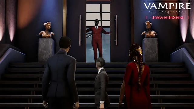
Vampire the Masquerade: Swansong is a roleplaying game based on the original tabletop RPG created by White Wolf Publishing. Like the tabletop game, the video game focuses on vampire political intrigue and investigation. Unlike many video games, Swansong features three different protagonists that intermingle throughout the story. To that end, the plot of the video game is interesting if not a little disjointed for many.

Gameplay

One of the first points about Vampire the Masquerade: Swansong is that the game is quite gruesome. Furthermore, the video game drops players in the middle of a story which is confusing to new players of the genre, and the hook I found to be somewhat strange.

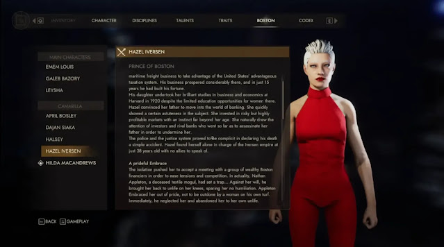
As a player of the tabletop RPG and the Live-Action version, it’s quite apparent to me that this game is designed around players familiar with the World of Darkness. I know this because of the dialogue choices, cutscenes, political structure, and available character abilities. Characters mention clans like they themselves indicated specific traits. However, if players aren’t familiar with clan traits and backgrounds, Swansong provides a handy codex! To newer players, this is useful, but to experienced players, information is sometimes shoe-horned through dialogue.

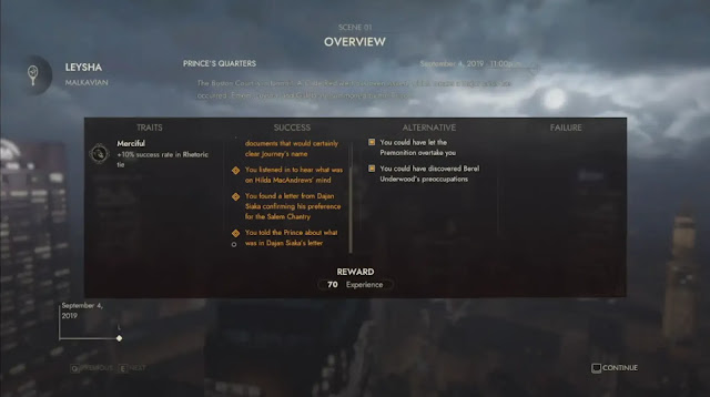
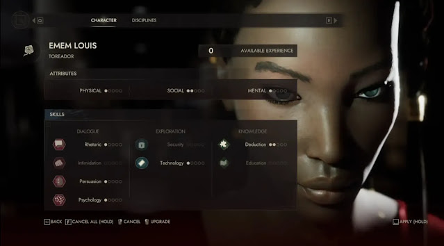
Swansong features skills and disciplines familiar to World of Darkness fans. At the end of a scene, players gain experience based on their success rate which is where players can boost their abilities. In this way, Swansong feels very much like a tabletop game portrayed in video game format. During a tabletop or live-action game, players begin without knowing what they are walking into. It is only after certain events do players receive their experience points. 

Experience screen at the end of a story section

The Story

The storytelling in Swansong is done moderately well. Protagonists interconnect through their individual stories, which is fascinating. For the most part, while it seems to be disjointed at times, the character connections blend well together. That said, the beginning part of the story is what bothers me the most.

We answer the Prince's call because Vampire society is in the middle of a ‘Code Red’. The Prince indicates to your character Emem that you can be part of the Primogen Council. For me, this is the first problem. Emem, Galeb, and Leysha are all 12th or 13th generation. Thus, are all new vampires that have NO STANDING in vampire society. Beginning at such a low level without having achieved anything significant doesn’t mean players can be on the council. I expect that vampires between the 3rd and 7th generation would be selected, not any of these three characters! It just doesn't make any sense.

The Codex, featuring the Prince of Boston

Incidentally, that isn’t the only aspect of the introduction that irks me. Players begin in a large establishment that requires a good deal of walking around. And thus, it is easy to run around in circles. Also, there is no central database for collected information! Swansong requires players to write down information or simply remember. Thankfully, players can screenshot information - oh wait Epic… *ahem* Moving on...

Dialogue

The dialogue in this game often bothered me for a couple of reasons. Firstly, the introduction has cringe-worthy dialogue when clan names are inserted into a discussion like the names themselves are significant. My problem is often the wording. I chalk it up to the writers attempting to make significant points in a short time but they spectacularly fail at it. This aspect needs work, in my opinion.

Secondly, the voice acting felt a bit stilted due to the writing. I know that dialogue is challenging but sometimes Swansong misses the mark. Also, the pronunciation of certain words grates on my nerves. For example, I can't stand how characters pronounce Camarilla. It is also not the only example of a different pronunciation either, just the most obvious one. 

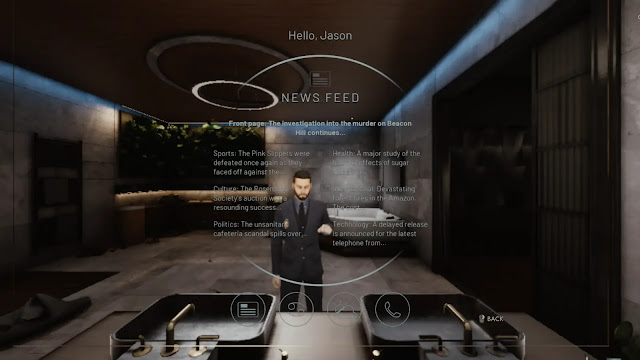
Galeb looking at a neat digital phone on the mirror

Regardless of those points, dialogue not only gives players key information but also gives them the option to use character abilities. Players can use psychology, persuasion, intimidation, or rhetoric to gain information. The more points players put into their abilities, the easier the late game becomes. I enjoy this aspect of gameplay because players are able to boost their success percentage when augmenting abilities using their willpower.

Confrontations

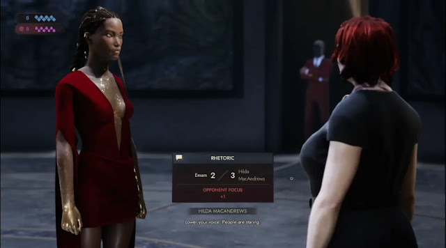
During dialogue sections, players will face a mechanic known as a confrontation. Confrontations occur frequently in real life, so including this element in dialogue not only makes information gathering interesting but makes dialogue much more dynamic. This is an element that I enjoy in Swansong since players can miss out on critical information should they fail. Even if players choose to focus on one of their abilities, there is no guarantee that players will be successful during a confrontation. As such, players must manage their willpower and blood usage at all times.

Confrontation box when the NPC uses their focus

Investigation

Regular readers know that I love investigation games. This one hooked its fangs into me rather quickly because I wanted to know what was happening. Having said that, I find that some of the clues to solving puzzles were too obfuscated for many gamers. Today, people rely too heavily on hints to progress a story where Swansong doesn’t hold the player's hand as other games do. Additionally, players can't save scum their progress. Since this direction was taken, I had hoped that there would be an in-game notebook or something to log gathered information because players are expected to solve puzzles themselves. Personally, I think the inclusion of an in-game logging system would be beneficial to Swansong. Or, you know, for Epic Games to have a screenshot function...

Character Experience

Unlike the tabletop RPG, the experience distribution is different. According to the 20th Anniversary Edition of Vampire the Masquerade's rulebook (shown below), raising an ability is double the cost of what it is going up to. If going from 1 point to 2 points, it will cost 4 points in the tabletop version. However, in Swansong, using the same example would cost a total of 30 points. This may be higher because of the lack of combat which allows for a much higher ability to spend skill points. While I find that these values are quite a bit higher than they should be, it forces players to carefully spend their experience. If players try to branch out too much, gameplay will become virtually impossible later on. However, the game always gives players one path to pursue, regardless of their skill expenditures.

The character sheet

Graphics

Swansong has some amazing graphics which span from elaborate prison cells to bloody crime scenes to large underground garages. The detail in many of the locations is breathtaking. I love the vacation area inside a building which feels like a player is in a whole other location. As such, players might forget they are inside a large apartment building. Also, the party location is quite immersive and rather gruesome because it is incredibly bloody. The developers certainly know how to create a dark atmosphere.

That said, of the main characters, Galeb is the one that is visually the best. The artists did a fantastic job of nailing a brooding and strong vampire with a piercing gaze. Emem has a fantastic rebellious nature and her outfit kicks ass. Even her expressions look great. Leysha, however, has a facial expression that just doesn’t sell the character's emotion well. Thus, while I generally love the look of the game, there are characters and graphical aspects that I wasn’t crazy about. Apart from that, the only other glaring issue I had was the lighting. In several locations, it was simply too bright, even after adjusting the settings. Having some options to reduce the bloom or the glare would be a fantastic addition, in my opinion. 

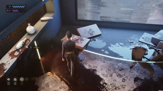
Leysha investigating the party scene

Final Thoughts

Overall, Vampire the Masquerade: Swansong is an intriguing RPG investigation game that just misses the mark. While I do love the game, some aspects need a bit of improvement to get players to sink their teeth into it.

Summary and Score

Big Bad Wolf did a great job translating a tabletop RPG into a video game format by showcasing disciplines and abilities in a way that works well in this medium. Having the ability to see what Auspex visually looks like is fantastic. Plus, the overall aesthetic of Vampire the Masquerade: Swansong is quite impressive if not different. I feel as though the investigation aspects could be fleshed out more, but they weren't too challenging for a puzzle aficionado to play without any assistance.

Swansong doesn’t scream game of the year, but it is visually detailed and grim, set within a rich world. I love it despite the minor flaws it has. 

Score: 8 / 10


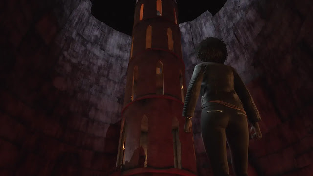
Emem in a strange place


Share:

Ragnorium Review

Ragnorium by developer Vitali Kirpu Productions and publisher Devolver DigitalPC (Steam) review written by Hayden with a copy provided by the publisher.

Estimated reading time: 7 minutes.


Ragnorium is one of the steady trickle of colony sim games we see that wants to be an end-to-end civilization builder. Like many games before it, Ragnorium has grand dreams and shoots for the moon - whether or not it gets there is debatable. To explain what I mean by that, let’s take a look at what Ragnorium does and doesn’t do...

The Good

Unified lore

Ragnorium has a few strengths that it builds on. First, Ragnorium presents a clearly defined world with obvious antagonists. The player is cast as a commander in remote control of a group of clone colonists. Quickly, it is presented that there is a techno-religious power in the area that will attack you on sight. This presents a clear motivation for the player to build up as quickly as possible, and unifies your view of the various antagonist units scattered around each planet map.

More tech than you can shake a stick at

Second, an extremely in-depth progression and objective tree gives the player lots to do. Technology and objectives are mostly gated behind a “commander level” stat, which increases as you develop your colony. Progress is incremental, with each technology giving you access to a discrete ‘thing’ - a buildable structure, furniture, crafting recipe, etc. Objectives are unlocked in batches through research options in clearly labeled technology entries. Each objective provides a reward (upgrades, resources, etc.), although there are times where the reward can be hard to see.

So detailed that I even have to teach them how to start a fire, where to pee and where to sleep!

Location, location, location

Third, Ragnorium provides a fairly novel landing-site selection system to the player. This system is used both for choosing the initial colony site and for choosing where future supply missions land. Players first use Influence (earned by completed objectives while building your colony) to purchase modules on a supply ship. Once launched, a high-altitude view of the ship allows the player to see the map as the ship flies. Clicking a location lets you specify which of the purchased modules land there, before returning to the normal camera angle. This is not a one-and-done experience as the player can have multiple ships launched to bring additional colonists and supplies. Your limits are solely what influence you saved up to make the request.

Tilt, pan and select a landing site as your colony ship flies over the landscape.

Collect -all- the things

Fourth, Ragnorium has a fantastic variety of materials to interact with. These range from the expected early staples of wood and stone, right through a slew of animal products (leather, fats, assorted meats) and special minerals like flint. The game itself is big enough - and slow enough - that after multiple hours on a single playthrough I still hadn’t even reached the point of metalworking.

It gets better

Finally, independent developer Vitali Kirpu is extremely active, pushing out six rounds of patches in the three weeks post-launch. Addressing items ranging from pathing optimization and balance to issues reported by the community, the difference between version 1.0 and 1.06 three weeks later is commendable. In all honesty, the changes flowing out in these first three weeks post-launch have saved Ragnorium from what was shaping up to be an extremely unflattering review.

The Questionable

Can you see me? Can you see me now?

Ragnorium makes some questionable decisions in how the game is presented. Top of that list is the visual style that the developer chose to use. Even at a fairly standard 1920x1080 resolution the game looks grainy and a bit oversaturated, especially when it comes to moving units (including the player’s own colonists). The result of this is that the game felt like I was playing through a poor-resolution security monitor rather than on my desktop that handles beasts like Star Citizen competently.

High-resolution modern game or bank security camera feed – you decide!

You can't use what you can't find

Close behind is the game’s choice of color palette. A player’s first experience in a game should always be in an optimal situation to understand the user interface (UI), providing enough contrast that the game can quickly train the player on what to look for. Ragnorium, however, uses a generic small white pulsing dot to mark some important interactables even when the terrain in the area is a pale beige that provides the markers with excellent camouflage. Other interactables (collectable stone, for example) are even harder to spot, appearing as just a few pixels of what could be shading.

There are a total of five fishing spots along the edge of the lake in this picture. Can you spot them all?

Slow is an understatement

Third on the list is camera movement. As shown in the image above, the maximum zoom out is frustratingly small and gives very little sense of your surroundings. Although you can pan and rotate, the camera's movement speed the camera feels like you are pushing through mud. This turns a simple objective like “hunt 3 rabbits” into a five minute exercise in aggravation as you slowly. Pan. Around. The. Map. To. Try. To. Find. A. Something. This doesn’t really add anything to the game, and just forced me to pause while I wasted five minutes or more looking for a particular item or creature

The Bad

Colony (mis)management

Ragnorium is at its heart a management game, like most other colony sims. That brings with it the expectations of support for successful management: relevant data, when you need it, in a way that you can access. In this respect Ragnorium is weak, with few tooltips that contain relevant information, including some obvious gaps. An early example is missing information on what is contained in some of the supply canisters the game invites you to spend your very limited influence on when launching a ship.

Player management of colonist tasks and equipment is done strictly at the individual level. There was no way to see overall performance, consumption or task assignment priorities across your colony that I could find. Coming from colony sims like Going Medieval and Rimworld that are extremely transparent about how task priorities work, the lack of information in Ragnorium on how the game chooses between equal-priority tasks felt disappointingly opaque.

No information here on how equal-priority tasks are chosen between, and no visibility on what other colonists have been set to.

Death by Difficulty

Pampered gamers have come to expect a certain level of customization in their game experiences. In particular, common practice is to give players a variety of difficulty settings to suit experience and playstyle. Ragnorium bucks this trend, and instead offers three settings on game creation:


While option 1 is 'extreme difficulty', option 2 only says that it drops the dynamic event system. Option 3 looks like option 2 plus a tutorial, implying they have the same difficulty settings. I read this as everything being “extreme difficulty”, with my only real choices being ‘dynamic events' and ‘tutorial text' on/off.

The ‘extreme difficulty’ that Ragnorium mentions is no joke. This game is one that can be very punishing at any time. Combat objectives frequently limit how many colonists can be sent, creating artificially difficult combat balances, killing your units. Apparently solo NPC resource guards pull in reinforcements from a full screen away. Even a single basic squirrel can beat your armed colonists one on one! There is only one conclusion here: Ragnorium wants you to die.

Mix the combat system with the almost-invisible interaction markers for basic items like water and food sources. Add in collectables like stone or flint that are barely visible as a few off-color pixels. Top this with a lack of any reports to give a sense of how long your supplies will last. Garnish with basic technologies like farming gated behind combat missions and you’ll have a recipe that often looks like this:


Conclusion

I want to like Ragnorium. The game gets enough right that I feel like there is a core that could be very enjoyable to play. The game’s punishing mechanics, lack of feedback to support planning, poor visual choices and frustratingly unresponsive camera stand in the way of this, however. The developer might fix these based on the stream of updates that has come post-launch, but that is just hope currently. In the end, this is not a game I would recommend over other choices available right now.

Summary

Ragnorium is an aspirational colony sim that tries to take the player from the stone age to the space age. Promising features like an expansive tech tree and huge variety of usable resources are hamstrung by overly punishing difficulty mechanics, poor UI choices and a camera that is less responsive than some elected representatives.

Score: 6.5 / 10


Share:

Random posts

Our Streamers

Susan "Jagtress" N.


S.M. Carrière

Louis aka Esefine

Aldren


Affiliates

JenEricDesigns – Coffee that ships to the US and Canada

JenEricDesigns – Coffee that ships to the US and Canada
Light, Medium and Dark Roast Coffee available.

Blog Archive

Labels