Pharaoh: A New Era by developer Triskell Interactive and publisher Dotemu—PC (Steam) review written by Susan N. with a copy provided by the publisher.
Estimated reading time: 10 minutes
Intro
In 1999 a studio focused on historical strategy games called Impressions Games released a city builder named Pharaoh with new and fresh features. Later the game devs released the Cleopatra: Queen of the Nile expansion which would greater enhance the experience for city-building strategists. It was a pioneer in the genre even with amazing titles like Caesar III, Emperor: Rise of the Middle Kingdom, Zeus: Master of Olympus, and SimCity 2000 which were released in the same era.
Today, French video game studio Triskell Interactive released an updated version of the classic Pharaoh city builder with better graphics, an improved UI, and a few quality-of-life additions to help the game gain more notoriety as one of the best city builders.
Gameplay
Pharaoh: A New Era brings back immediate nostalgia due to the overall look and feel. The tutorial and campaign brought me back to a simpler time in video gaming when games were challenging for different reasons than today. For one thing, many of the campaign levels require you to meet population goals or a certain amount of money in your vault. It has monuments that need to be built and Gods that will wreak havoc on your city should you neglect them.
Immediately, I’m reminded of my dislike of roadblocks because they would often prevent citizens from reaching destinations that they need to go. This classic game design also painfully reminded me of the need to watch the pedestrians like hawks. Did the water distributor turn right or left when he left the building? That might be one of those things that gamers today might not think about, but it’s *absolutely critical* to know that information so that you can plan accordingly. This is for a couple of reasons. City builders back in the 90s were designed so that the workers would always turn in one direction because the AI wasn’t nearly as advanced. Imagine having a nice residential block. Down the road, you place an intersection to divide your commercial and industrial areas. Close to the intersection you have a nice water well to provide for your residents. This worker is going to walk out of the building with two tasks: 1) to walk a certain number of squares from their home building, and 2) will turn the same way without fail. One intersection can lead the water distributor into areas that have no residents. Even though it would make sense to have the worker go door to door, the programs’ sophistication wasn’t high. (Just look at that rogue water carrier!)
Also back in the early days of city building glory was the lack of a certain feature or two that are included nowadays. The most notable for many is the inability to rotate the map. Such a feature was not popular in a city-building game until Emperor: Rise of the Middle Kingdom which was released in 2002. (Although, SimCity 2000 which was released in 1993 did have map rotation. The decision not to have the feature may have been purely a design decision.) Instead, players needed to use an overlay to show buildings of the same type. For example, toggling the services tab will grey out all buildings that are not considered a service. Whenever larger buildings are placed in a way where a roadblock or a missing piece of road might be, using the overlays make it easier to find those issues. Part of the reason this feature is needed is because if buildings burn down, they leave patches of rubble. A house consists of four squares and when one burns down, you must demolish them individually before replacing it.
As for how the game plays, it is similar to what I remember from the 90’s, complete with its gripes and all. You can check how much of a worker pool is available, how much resources you have on hand, and see if you’ve appeased the Gods enough to sate their insatiable hunger for attention.
There is a handy copy-and-paste feature that players can use to make their experience better. Plus, there is both a campaign mode and a creative mode. For those looking for a progressive experience, they can go through the campaign which has objectives to be fulfilled before heading to the next map. What makes the mode challenging, aside from some of the obvious setbacks, is the fact that some of the later maps will start you on a previous city design. What I mean is, if you created a map in Nubt early in the campaign, later on, you may return to the same map with whatever horrible layout you had. Then it will allow you to add other services that weren’t available at the time. Essentially, that perfect city build might not be perfect for building a monument!
Graphics and UI
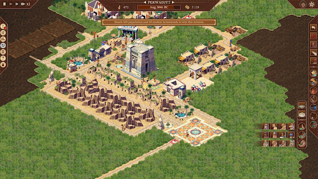
Pharaoh: A New Era has dramatically improved its graphics. The detail of each building is astounding, especially when you consider how much of the assets remain true to the original design. In a side-by-side comparison, there is a ton of similarity between the original and new versions of the game. Not only am I impressed by the rich detail, but I found myself to be in awe of them. The game definitely is nostalgic for many city-building lovers.
One of the best updates made to the game is the UI layout. In the original version, we struggled with too much stylization of the text. While this never hindered the gameplay, the UI used to have a ton of extra design elements that were unneeded. At the time, that made us feel like we were immersed in Egypt - hieroglyphics and all - whereas today the old UI design was too busy. Pharaoh: A New Era is much cleaner while still impressing upon us the Egyptian ambiance.
On the sidebar, the developers have split the buildings into categories with pictures that are clear. The first of those groupings are services like wells, firehouses, and station houses. The last of the groups have all sorts of beautification items like statues or gardens.
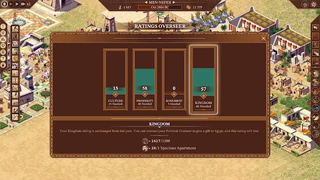
The left sidebar has groups like overseers. There is an overseer for religion, housing, profit, commerce, politics, and workers. Each overseer will show more details on one specific aspect of your city. For example, the ratings overseer displays how high your rating is with respect to the overall culture, prosperity, monument, and Kingdom. These will increase or decrease depending on what amenities and resources your people have. Some of the overseer windows allow you access to holding a festival (Overseer of the Temples) or place a priority rating for each worker category. Thus, the overseer menus help you decide on changes you need to make to advance through the campaign or improve your city.
At the top of the screen, you are able to control the speed of gameplay, access the menu, and specific city metrics. The name of your city is displayed in the center of the screen along with the total population, the date, and cash on hand. One additional feature of the top bar is a drop-down arrow that displays the tide for the floodplains. This feature is useful for tracking the harvesting season in case your people have eaten more than you planned for!
Pros and Cons
For the most part, I have very few grievances about Pharaoh: A New Era as it has improved dramatically since its original release. The UI is incredibly well done as it delivers a ton of information without being too busy. One of the changes I love with respect to the UI is some of the menu designs. An example is in the storage yard menu. It displays the products, total number stored, status of the product, and a handy coloured radical. On first glance, that coloured circle seems to be unimportant, but it actually allows you to control how much of a product can be stored. Instead of holding all of the products it can manage, you can click on the green circle to only accept half or a quarter of the total amount of one product it can hold.
Overall there are very few aspects of the gameplay that I dislike. Though, that’s not to say they don’t exist. Like every game, Pharaoh has its share of issues and bugs although I didn't experience a ton of them with a review copy of the game.
For one thing, the most negative aspect for me was the strange decisions made in the trading menu. I feel like it isn’t as good as it could be. See, in other city-building games, you could buy and sell products individually and you had more flexibility in total units. For each resource, there are two interactive icons, a drop-down status bar, units, and then the monetary cost to import or export to that city. In order to trade anything, a deposit has to be made to initiate a trading route. Then you must click the righthand button to allow the product to be imported and exported. During the campaign, this screen is heavily restricted as you may only be allowed to trade specific products. There was no option to offer something else at a reduced cost because its not something they needed. Honestly, it’s not my favourite design which is why I consider it to be a negative aspect.
Another minor issue that I experienced is a popup not displaying properly. In an earlier review build, the popup indicating that a new festival would begin in a month would properly display. After the game launched, the game would display half of a sentence and some bit of coding afterwards like someone forgot to put a semicolon in the programming. For me, most of the bugs were quite minor and easily fixed in a patch or two. Although, making sure the game doesn't crash every so often would be nice. Thankfully this was only an issue a handful of times at best. Addressing those issues are paramount to the success of the game.
The lack of a mini-map is also an issue. In a couple of the campaign maps where you need to place a palace and well on the grass while warehouses could be erected on the sand, having the ability to see the geographical features is key to building a prosperous city. Most people will take stock of the available buildable area and plan accordingly, but being able to see the whole map at a glance would be advantageous. (Having said that I’m aware that the game devs are implementing a mini-map in the near future! Thus, you won’t need to deal with the minor inconvenience.)
Final Thoughts
Pharaoh: A New Age is a fantastic update to the original title. It is vibrant and detailed with its improved graphics quality. The game also has a bunch of quality-of-life features that add to the appeal of this classic city builder. Even though most people have mixed feelings about the game because of today’s gaming standards, it remains true to its roots without sacrificing its quality. Pharaoh also remains challenging in some aspects as players need to juggle a ton of different tasks to have a prosperous city in Ancient Egypt.
This updated version of Pharaoh: A New Age is fantastic, in my opinion. It brings back feelings of nostalgia and strategy in a genre that isn't always successful at challenging players through a campaign mode. Anyone who is looking for a clean-looking city builder with gorgeous graphics, a clean UI, and offers hours of entertainment can stop their search because Pharaoh: A New Age is a fantastic update to the original game.
Score: 8 out of 10


0 comments:
Post a Comment