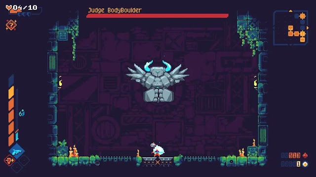
• Metal Slug Tactics - PC Review

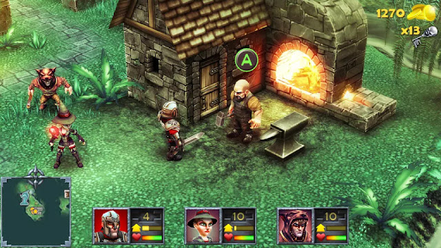
    The Metal Slug series has been around for a long time, and despite its age, the titles tend to stand the test of time. They have a fun, colorful visual style that ages gracefully...

  • Eden Crafters - PC Preview

    In this open-world game you are challenged with turning a hostile planet into a habitable haven for all of human kind. You have the ability and equipment to temper the climate, and to create a breathable atmosphere!

  • Dungeon Inn - PC (Steam) Review

    Dungeon Inn is a cozy strategy management game that has an amusing story. The premise? Sara and her crew end up trifling with a scary dragon who catches them red-handed stealing from him.

  • Shadows are Alive - PC(Steam) Preview

    Shadows are Alive is an interesting sort of mash-up of a lot of fairly popular titles coming together to create a pretty solid premise. A weird mix of Player vs. Player, puzzle solving, and exploration...

  • V Rising 1.0 Reviewed by a few Vampires

    Come one! Come All! Listen as we regale you with details of a vampire game that fully released on May 8th with more content, bosses, and just loads of fun!

  • 9 R.I.P. - Switch Review

    Hey! Have you ever heard the ghost story about the "Bansh-Otome Ghost"? They say she roams web forums for victims. If you stay up too late...

  • Natsu-Mon: 20th Century Summer Kid

    Going into Natsu-Mon I wasn't sure what to expect. I watched the trailer and knew it was about a ten-year-old boy on summer vacation and from what I saw it looked like a mix of Harvest Moon and Animal Crossing...

  • 8-Bit Adventures 2 - PS4/5 Review

    8-Bit Adventures 2: The Adventures of Squishy, is finally here on consoles! Who's Squishy you ask? Squishy is your robot and totally the main protagonist.

  • Sea Power: Naval Combat in the Missile Age - PC Preview

    Placing you in command of either NATO or Warsaw Pact nations, Sea Power is an incredibly detailed simulation of modern naval combat and will test you every step of the way.

Warhammer: Chaosbane - Slayer Edition - PS5 Review

Warhammer: Chaosbane - Slayer Edition by developer Eko Software and publisher NaconSony PlayStation 5 review written by Pierre-Yves with a copy provided by the publisher.

Estimated reading time: 5 minutes


If there’s one interesting aspect that comes with the territory of reviewing a title, it would be re-reviewing it slightly down the line and on a brand new platform. Having covered Chaosbane on the PC from the original Early Access version, to the updated Beta, then the first full expansion and finally into the new freely added character (Part 1 / Part 2), Chaosbane is back for both the Sony PlayStation 5 and the Microsoft Xbox Series X as the Warhammer Chaosbane - Slayer Edition. Once again diving into this fantasy based Warhammer title, and better with a partner, I’ve dived into combat alongside Izzy while also using the latest addition to the title with the newly added Witch Hunter.

Just in case you’ve missed all of the above coverage, hey it happens the internet is a vast sea of information, Eko Software and Nacon’s Warhammer: Chaosbane is a stage based Hack & Slash adventure that sees a group of heroes set out in order to save the would be Human Emperor Magnus from the curse set upon him by the forces of Chaos that have invaded the Capital. Now totaling six heroes (achievements for only the core four mind you), there's some choice for how you want to tackle the hordes ahead.


Upfront, even with the newest coat of paint and a few new stages and hub layout elements, Chaosbane remains much of the same. You get some dialog, you head out into a stage, finish some objectives, head back to the hub. Rinse. Repeat. Four acts later and you're done the main campaign. By this point you can either head into the only current expansion, the free based stages that were created to introduce the Engineer, or the "end game" content that could keep you busy for a while with all of its challenges.

It's fun in either short bite sized sessions or an entire afternoon with crappy weather outside. That said though, there's still no current overarching plan for longevity such as Diablo 3 or Path of Exiles seasons that keep players coming back for more. There's a fair amount of end game but once you're done, you're done. Playing on the console for the first time as well it felt even more finite as it didn't take very long or that much effort to score a platinum trophy and honestly? It's generally not something that I do but with how close I was I figured why not? I'm now up to 9 "plats" after the introduction of trophies all those years ago on the PS3 compared to Richard's 30 (which mostly consists of 2-300 hour jrpgs) or Izzy's 11 and she just really started playing games this past summer.


One thing that did impress me though was the utilization of the DualSense. The haptic feedback on certain abilities which got stronger as you updated them was neat, but having the triggers lock or get tougher to press while abilities were almost ready was also a nice touch. Is it a gimmick? Yes. Does it make things easier as you don't actually have to look at the cooldowns to use them? It does yes making the whole experience just that little bit more immersive as you're not constantly looking at the cooldowns on your major abilities.

If there's one thing that did bother me this time around it was how small the inventory and skill screens were in local coop. And I mean SMALL with no way to enlarge it to a decent size in order to actually read what's on the screen. While not as important in the beginning, eventually green attack and defense powers aren't enough without knowing what other kinds of bonuses can be found. If you can't read them, you won't be making the right choice as you up the Chaos difficulty especially. Torment levels for Diablo fans.


The other issue with this latest version actually comes from what should have been a bit of an added atmospheric bonus. The hubs are now larger, there are people in it, the people chat and add in some life, BUT, you now have to go even further in between missions to get to your next stage. There's only really one NPC to deal with and with no vendors, the hubs are just empty spaces and having to make you run further while in a campaign is a bit of a pain. I'm still hoping for shops and stuff in an update.

Summary

Otherwise, Eko Software and Nacon's Warhammer Chaosbane - Slayer Edition is still a decent Hack & Slash and it runs fairly well on the PS5 though there were a few crashes here and there in the Fourth Act. Now with six characters for up to four players to dive in together, this is a perfect game if you’ve been looking for an alternative to the other Hack & Slashes that may be between “seasoned” content.

Score: 7.5 / 10


Share:

Bubble Bobble 4 Friends: The Baron is Back - PS4 Review

Bubble Bobble 4 Friends: The Baron is Back by developer ININ Games and publisher Taito CorporationSony PlayStation 4 review written by Nick with a copy provided by the publisher.

Estimated reading time: 5 minutes


Bubble Bobble 4 Friends: The Baron is Back may be a bit of a mouthful, but it’s also a game full of exciting, bubbly dino action. If you are familiar with the previously released Switch game Bubble Bobble 4 Friends, you pretty much know what to expect here – but with more of it. That game was fun, but this expanded iteration provides even more content and another game mode.

Now, I have a bit of history with this series that gives me something of a soft spot for it right out of the gates. I remember the arcade cabinet from the 80’s and it was one of my very first NES games after getting the console for Christmas from my uncle (Editor's Note (PY): I'm not as old to know there was an arcade but I've got seriously fond memories of the NES version growing up). There’s some good memories baked into this series, which I have poked at now and again over the years.


For those unfamiliar with Bub and Bob’s antics, well… don’t expect any great prose here. Bonner is the bad guy and he needs to be dealt with. It doesn’t really get more involved than that. However, the value in this series has always been in its simple yet ridiculously addictive formula. Each stage is a single screen that doesn’t scroll anywhere, and it kind of meshes platforming, action and some light strategic / puzzle solving elements together for its core gameplay.

You clear a stage by blowing bubbles at your enemies to trap them within. Your bubbles also serve as makeshift platforms that can help you reach areas otherwise not accessible. Where Bubble Bobble 4 Friends managed to shake up for formula a bit is in the introduction of skills, which are attained through beating the bosses. In the original version of the game, you had fifty levels, but Bubble Bobble 4 Friends: The Baron is Back gives us 100 now to work through, effectively doubling the content. It feels like a much more appropriate length, as admittedly I just like the party was over too quickly with the first iteration, but this time the length just seemed about right. It didn’t end too soon, and Bubble Bobble 4 Friends: The Baron is Back didn’t overstay its welcome.


The earlier games in the series focused on Bub and Bob, giving it a glorious co-op mode that made for some frenzied, often hilarious action. Bubble Bobble 4 Friends upped the stakes by providing 4 player co-op, and it makes things even zanier now. There are admittedly times when all that chaos can make things a bit hard to keep track of, but I’d be lying if I said we weren’t laughing a lot more often than we were getting annoyed. My three kids and I had a great time with it. You can certainly play the game in single-player, and Bubble Bobble 4 Friends: The Baron is Back is still a good deal of fun, but it loses the element of unpredictability that makes the co-op such a hoot. That being said, it feels like a bit of a missed opportunity is that this is all couch co-op. Great for me – I have a family of five. Less than ideal for people who maybe don’t have in-house partners to rely on, especially in this day and age where socially gathering is less common.

Aside from the fifty new levels, there is a new mode that reflects the title called The Baron is Back. This essentially adds another fifty levels of gameplay as you are tasked with ascending a tower. The level design is notably different, with tighter spaces that made the experience far more challenging for me than the core mode. I did not struggle much with the core one hundred levels, but The Baron is Back kicked my tail more than a few times and definitely made me reconsider how I was approaching the gameplay.


In terms of presentation, the Bubble Bobble series has always been pretty undemanding of the hardware, but with a cute, colorful style that makes it very family friendly. There’s not much to the character models, but they look fine in their animations and the vibrant stages tend to be very appealing. The music has a peppiness to it that matches the visuals and overall tempo of the game rather nicely as well. It’s clear that the developers had a good time with the stage designs, some of which are just creative, colorful backgrounds while others are very specifically themed.

Summary

Bubble Bobble 4 Friends: The Baron is Back is a great addition to a classic arcade style game that challenges your thinking and your reflexes at the same time. It has that bite-sized, addictive “one more stage” quality with a sizeable amount of content to boot. It certainly works better as a multiplayer game than a single and can provide lots of chaotic good times with the right group playing it. The core concept is relatively simple, but it is a challenge to master.

Score: 8 / 10


Share:

REKT! High Octane Stunts - PC Review

REKT! High Octane Stunts by developer Little Chicken Games Company and publisher No Gravity GamesPC (Steam) review written by Susan N. with a copy provided by the publisher.

Estimated reading time: 5 minutes


I'm a sucker for a good stunts racing game, especially if it gives me the opportunity to do awesome things that that most racing games today don't offer. Unfortunately, while Rekt! High Octane Stunts offers a fun experience for a couple of hours, I feel like this Tony Hawkesque experience isn't quite what I was hoping for.

Rekt! Gameplay

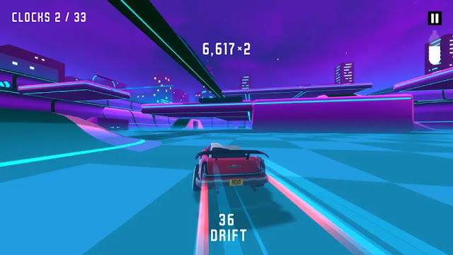
Rekt! High Octane Stunts has a clean and fun arcade experience. Players are able to choose a practice mode, high score mode, or a local co-op mode. Once in practice mode, players can drive up ramps to execute flips, drift, and drive up a loop-de-loop on a preset course which awards points and currency.

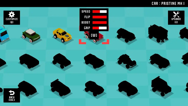
The points players gains go towards unlocking new cars, which is done automatically after you leave to arena. Players also receive a currency as they complete objectives given at the beginning of each run. This currency is used to unlock the other four available arenas in the game. The currency gained from the objectives also goes towards upgrading your cars. Rekt! High Octane Stunts has over 50 cars to choose from and players can improve the cars' speed, boost, grip, and flip. capabilities.


My biggest issue with Rekt! is that there aren't more maps to experience. While it's neat to have maps change colors as you gain higher points, I would love to have more variety in arenas. In fact, I expected that a game titled 'High Octane Stunts' would allow players to make their own courses, even if it was done with pre-generated assets. This would add to the replayability of the game, in my opinion.

Most of the racing games allow remapping of the controls, which is one reason that caused me a great deal of frustration. While the controls are relatively common in the racing genre, I hate that I can't change anything like the sensitivity, camera POV, or the air roll buttons. Also, on the topic of controls, the keyboard controls are counter-intuitive and abysmal! To drive, players use the arrow keys but the air roll keys and boost are elsewhere! As a person that uses the WASD keys for everything except DDR or ITG, this set up is awful.


Graphics

I do enjoy the graphics of Rekt! High Octane Stunts. It is low poly in design similar to an old arcade game like F-Zero (which is the closest graphical comparison to this title). The overall look isn't an eyesore. As I mentioned previously, the arena map changes colors after players successfully land their tricks.

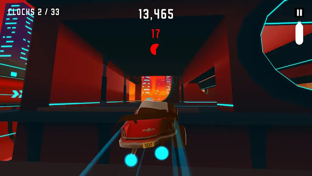
One of the neat things about Rekt! High Octane Stunts is the fact that every time a player botches a landing, the car will visibly become damaged. This is an element of several racing games, but this one represents it more intensely. Instead of bumpers falling off or scratch marks appearing, the entire side of the vehicle will contort.


One of my concerns with Rekt! is the lack of accessibility. There isn't a mode specifically designed for those who are colorblind, nor are there options to increase or decrease the brightness. Rekt! gives players basic options like: Resolution, graphics level, visual effects, windowed mode, and V-sync. Though, I will give the game credit that I could run the game smoothly without much issue - despite my PC issues.

While I'm on the subject of graphics, I absolutely despise split screen. Not only is it harder to see what is happening, but it means there's no real multiplayer. To me, racing games are better against other players or an AI.

Pros and Cons

Rekt! High Octane is not a bad racing game at all. It's fun to play around on a couple different arenas to land some killer tricks. That said, it also has a few issues, so let's look at the pros and cons.


Pros:

  • Suitable for All Ages

  • Do not need a high performance computer to play

  • Local Co-op

  • Highly affordable

  • Decent car customization

  • Lots of car choices

Cons:

  • No control remapping

  • Split screen multiplayer

  • Little graphics customization

  • Points are not banked at the end of a run

  • No player custom maps

  • Too few maps to choose from

  • Boost doesn't give that much extra speed


Final Rekt! Thoughts

Rekt! High Octane is a great game to pick up and play with the family. It's not graphically intense, has a couple of neat maps, and allows for a hours of enjoyment. It is fun to play but I found myself getting bored of the experience. In my opinion, the game just needs more substance to properly enjoy. Rekt's design is fantastic, the music is futuristic and fitting, and the level design is excellent.

I had a great time with Rekt! High Octane Stunts. It isn't highly intensive or elitist and allows for a relaxing experience. There's only competition between you and your own high score. Even though I found the game to be lacking in customization and level arenas, I give this title a solid 7 out of 10.

Score: 7 / 10


Share:

Scourgebringer - Switch Review

Scourgebringer by developers Flying Oak Games, E-Studio and publishers Dear Villagers, Yooreka StudiosNintendo Switch Review written by Richard with a copy provided by the publisher.

Estimated reading time: 4 minutes


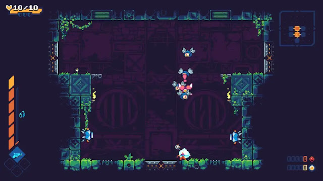
Scourgebringer is an extremely fast variant of the roguelite genre. With a 2D platforming style, you will hack and slash and shoot your way through many an enemy to discover the secrets of the alien structure you set out to explore. Scourgebringer is tough, it's fast, and it has plenty of enemies to beat.

In Scourgebringer you take on the role of Kyhra, a great warrior tasked with discovering the secrets of the alien structure that has brought ruin to the world. To do so, you must explore the procedurally generated labyrinth that you are dropped in, defeating all the enemies in each room you enter before being able to move on to the next. Your goal is to find the guardian on the floor and defeat it, so you can gain access to the floor boss in each area.


Kyhra has some fancy moves at her disposal, being able to not only leap around the rooms like a ninja, but also carrying a sword for slashing in light attack combos or heavy stunning blows, as well as a gun for shooting those pesky enemies a little to far away. Most rogue lite games have some sort of aspect they focus on, and for Scourgebringer that aspect is somewhat of a combination of "major speed" and "don't touch the floor". You will spend a lot of time airborne, between the light combo the majorly slows your descent, the dash attack that will also keep you aloft, the wall running and avoiding enemies and enemy bullets, if you spend most of your time on the ground, you probably aren't doing something right.

After ramming your face against the wall that is Scourgebringer and dying a few times, you may bring back judge blood to the central hub style area, where you can exchange this precious resource for upgrades you can buy on a literal tree. So now armed with extra help through increased health and the ability to reflect enemy bullets with the heavy attack, you're ready to challenge the alien blight again, and then promptly die upon making it to the next area, most likely. And yes, death means you start from the beginning of the first area again, although you keep the upgrades you've punched. The items you can find while exploring however? Those you don't keep.


When first playing, and got the feeling of Dead Cells but a little lighter on complexity from Scourgebringer. Both are 2D rogue like types, but Scourgebringer has the focus on individual rooms and fast paced combat. You don't have the time to settle down, and even some of the possible upgrades reward you for continuous fighting, or at least not touching the ground. While Scourgebringer is tough, fun, and charming, the pixelated sort of old school metroid graphics are a bit of a mixed bag. Did I appreciate the art style? Most definitely. Could it get hard to differentiate where you are, where enemies are, and what their bullets are doing? Very much so. Thankfully the bullet reflect does wonders for this provided you can prepare in time before the shots hit you.

Scourgebringer is great in the way it presents itself. It's simple enough that you don't get bogged down in special combos, different item combinations and skillsets, or minmaxing abilities to give you the best advantage. Yes there are different guns and you can pick up items to boost your abilities, but the core focus is on those abilities you unlock and how you use them. There is a learning curve with each new enemy, and you might get frustrated at seeing your progress reset each time you die, but you get better and faster each time.

Summary

Overall, Scourgebringer is a wonderful addition to the world of rogue lite games. It has a wonderful fast-paced feeling to it that makes those who want more action to take it speedier, while you still have the option to slow down if needed. The upgrade system is lenient enough that you don't feel like you aren't making any progress, and each individual room that makes up the sprawling labyrinth of kill boxes is reasonably constructed so as to not screw you over while still making clearing the room challenging. Scourgebringer is a great choice for anyone looking for a little bit of fast paced action, or a nice helping of pain that isn't quite absusive like Dead Cells or Dark Souls.

Score: 8 / 10


Share:

Observer: System Redux - PS5 Review

Observer: System Redux by developer Bloober Team and publisher AspyrSony PlayStation 5 Review written by Nick with a copy provided by the publisher.

Estimated reading time: 5 minutes


Observer: System Redux is the same basic title that came out a few years ago to rave reviews, but with a few new missions and updated visuals. If you missed this cyberpunk thrilled the first time, you absolutely owe it to yourself to play it. Having enjoyed the title myself in the past, I was more than happy to revisit this dark version of 2084 a second time.

You take the role of Daniel Lazarski, an Observer. This is the title given to those who hack into the minds of those who draw the attention of corporations – the true, new power in this dark version of 2084. Right off of the bat, to hear the protagonist voiced by now-deceased Rutger Hauer just lends an immediate weight to the character than it might have had in less capable hands.


While the content is described in some spaces as cyberpunk or thriller, I’d go so far as to say there’s a very strong sense of horror here, just in an unusual setting. Everything that worked about the storyline three years ago holds true today. The core plot device of Daniel hocking into the memories of both the living and deceased creates a very open template for the narrative, and it is used to great impact by developer Bloober Team (also known for the phycological horror game Layers of Fear). Dan’s work however, comes with risks and begins to compromise his own ability to process things. The abstract darkness of others’ dreams seem to be creeping into his own, adding that horror element that makes the atmosphere so thick with tension throughout.

While Observer: System Redux is largely an adventure game, there is a stealth element baked into the gameplay that was not always my favorite aspect of the original. It feels as though it has been finetuned here (admittedly, it’s been a few years and maybe I was just better at it having experienced this before?), but it seemed a little more forgiving this time. If that is the case, then I am appreciative as I vaguely recall feeling more frustrated when playing the title for the first time a few years ago. That being said, I enjoyed my second tour through the game and found myself more than willing to have conversations with the many unusual, memorable characters you can encounter along the way. Being an adventure game at heart, Observer: System Redux wants you to explore, and is at its best when you’re taking your time and just soaking the atmosphere.


There are some nice touches throughout as the protagonist’s grip on sanity starts to slip more and more, but I will not get into the actual story here. If you played the game a few years ago when it first released, you have a pretty good idea of what is going to happen here. The key plot points have not changed any, though the three additional cases are welcome and continue to add to the world-building. If you are new to the series, anything more than what I have said would prove to be a disservice to you, as the story is really the main reason to play this.

The sound design of the original game was already quite good (again, something the development team seems to have a really good handle on based on their other titles I’ve played in the past), and that remains true here. With a set of headphones on, the subtle ambiances are easier to pick up on and appreciate. However, the true improvement to the presentation comes in the visuals.


The original Observer was not an ugly game, but it is amazing what a few years can mean both in terms of the technology and the development team’s improving skills. Character models are notably improved, with more smoothness to the animations. Beyond the characters however, the environments are also markedly improved upon. I am a sucker for that cyberpunk, neon glowing aesthetic found in movies and games, and Observer: System Redux really nails this. The hum and glow of the world around you, punctuating the often dark, rain-slickened environments just melds wonderfully with the audio to create an immersive experience that I was more than happy to revisit despite having played the game a few years ago.

Summary

Observer: System Redux is a welcome update. At first I questioned why we were getting it so soon after the initial game’s release only a few years ago, but those concerns abated rather quickly. Small quality of life improvements to the gameplay make the experience less frustrating this time around, the additional missions are well-done and welcome additions and enough cannot be said about how much better the visuals look this time around. As someone who enjoyed the game when it first released, I did not regret my second time with it here. If you missed Observer three years ago and dig cyberpunk themes, you really do need to check this title out.

Score: 8.5 / 10


Share:

Battle Hunters - Switch Review

Battle Hunters by developer and publisher Phase Two Games Pty. Ltd.Nintendo Switch Review written by Pierre-Yves with a copy provided by the publisher.

Estimated reading time: 4 minutes


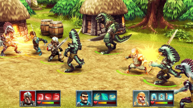
Having recently released, Battle Hunters is a real time strategy dungeon crawling RPG that sees some older adventures regather in order to overcome a new evil. Knowing that they cannot do it alone, our starting trinity of Knight, Wizard and Ranger set off to find others to recruit to their cause such as Rogues, Barbarians, Warrior Monks, Swordsmen, Space Marines and more.

Battle Hunters to me felt a lot like Rainbow Moon, the first title from SideQuest Studios before Rainbow Skies, which had a lot of good ideas and is quite mechanically sound, but, it feels like it misses the mark when it comes to storytelling and actually interacting with the world. Essentially, instead of developing the characters and having banter while walking around or before jumping into fights, the only dialog to be found here will be whilte recruiting your new members, when you take up a quest from a random NPC, or hit a story marker. There was so much potential to be more than simply a mechanical dungeon crawler but it wasn’t capitalized on.


So starting off with a short tutorial to give you an introduction to the mechanics that you’ll have plenty of time to master over the next several hours, it won’t take long for you to begin to get familiar with the available characters. If there’s one thing that you get taught early enough on, it’s that Battle Hunters is not an easy grind that you can simply set your controller down and leave on autopilot. With only three characters at a time and often against four to six others if not giant bosses, the level of micro management is something that I haven’t had to do in a while and I’ll be honest that it created a challenge that I gladly accepted.

Each character while on the field of battle can use items, move, defend, attack, and once leveled up enough use three special abilities with various cooldowns. Each action has a bit of time that is required to pull it off so if you decide to move, you can still be attacked by the foes surrounding that particular character which only gets worse the squishier they get. Magic types CANNOT take a hit which is pretty standard so their protection should always come first as they are often the first to be targeted.

One interesting aspect to combat is that none of your characters will ever start with a special ability at the ready making easy fights something to watch out for until they are ready and then it becomes easy to clear the field. Often though this won’t be the case as not only are you often outnumbered, you’re also underleveled and leveling actually doesn’t come easy as winning battles will often give you what I felt like was next to nothing in terms of experience. While it does make sense for the challenge aspect and how “early” you get all of your abilities, the challenge at times I felt like it would simply chase newcomers to the style away with such a high entry point in terms of difficulty.


Moving outside of battle though, you won’t be doing much other than walking across a map looking for the next fight which will often lead you to a “key” of sorts to unlock a door, bridge or portal, which will lead to more fights. It makes the world feel… empty. It’s there, and there are foes that are on the map that you’ll head towards, but that’s it. You have access to an alchemist who sells you potions and a merchant that sells you food in case you’ve used too much or haven’t picked enough out of the surrounding treasure chests. Otherwise, even from an audio standpoint, if you aren’t in battle there’s no background music and you’ve really got to crank the sound up to hear the ambient noises just adding to the emptiness that you’re moving your party through.

Summary

So while Battle Hunters is a mechanically sound real-time strategy dungeon crawler with loads of traditional Dungeons & Dragons character types (and not so traditional space marines) to fight off hordes of monsters, that’s about all it is. With a singular quest in mind, there isn’t much to do other than move from one fight onto the next with nothing else to do in the meantime. It’s good at what it does but I wish there had been more to do with the world and the characters themselves.

Score: 6.75 / 10


Share:

Hyrule Warriors: Age of Calamity - Switch Preview

Hyrule Warriors: Age of Calamity by developers Koei Tecmo, Omega Force and publisher Nintendo of AmericaNintendo Switch Preview written by Pierre-Yves from a Nintendo eShop Demo.

Estimated reading time: 6 minutes


If there are two series that will spark a heated debate as to which one is best, one is Final Fantasy, which I streamed Final Fantasy IV (THE BEST ONE) for Extra Life 2020, and the other is the Legend of Zelda. Having originally started with the Legend of Zelda II, I would later fall in love with a total of three titles. A Link to the Past, Twilight Princess, and Hyrule Warriors which while not a core title, merged all of the timelines into one making everything truly canon to the timeline theories which were also published not that long back in the Hyrule Historia.

Instead of making a follow up to the 2014 Hyrule Warriors, Omega Force and Tecmo Koei have instead done something that a lot of fans have probably been wanting just as much as the sequel to Breath of the Wild, and that would be the prequel of the events one-hundred years prior. Starting off with a bang in the last moments before Calamity Ganon wins, a tiny guardian stored within Hyrule Castle wakes up and sends itself to the past in order to warn and potentially save Princess Zelda and her father’s kingdom. Falling into the hands of Link who was at the time no more than a soldier of the kingdom clearly not wearing a helmet to stand out, his and Zelda’s fates would soon become intertwined as they always do.


From a story perspective there’s a lot that we are going to be in a treat for as other than some flashbacks or mentions, a lot of what happens was up for grabs while turning it into a gameplay experience. With events starting off before everything happens, before Calamity Ganon is even a thought, a horde of monsters brings Link and Impa together as Link is helping defend the kingdom. Link and Impa’s meeting alongside the small guardian start to really set the tone for the adventure while also showing that there’s more than just gameplay in some of these rather stellar looking cutscnes.

From the get go two things were abundantly clear. The combat and the mechanics are solid and they’ve revamped the characters for their Breath of the Wild counterparts from the original Hyrule Warriors which were specifically designed for that adventure. The second is that I’m really unsure of how well the graphical representation handles itself. The original was clear, crisp and highly detailed while Age of Calamity is using the more cell shaded style of Breath of the Wild and I don’t think it’s doing the action as much justice as it should and that’s after spending time with it on a standard LED, a 4K QLED and in handheld mode.


My issues with the graphics aside, and combat felt rather smooth with the three characters that the demo currently allows you access to. Link, Impa and Zelda all handle rather differently with Link being our sword wielding beast on the field, Impa using ninjutsu like abilities and Zelda very much relying on the powers of the slate for some rather wild attacks. Following more in line with the Dynasty Warriors style of mechanics, basic attacks are all mapped to “X” and then after a certain number of presses you can use “Y” to unleash a character specific ability.

Where things start to get a bit interesting is in the use of abilities that a lot of us have used while exploring a post-war era version of Hyrule set one-hundred years later. Getting access to the slate, Link can use bombs, freeze enemies and the water they are standing in, and even without it Link can take up to the air with his glider before coming back down on his enemies. Keeping partially in line with the semi-RPG elements of leveling up to become more powerful, there are a few changes this time around which could either be really nice down the line or a complete pain depending on how they are implemented.


Set out on the world map through accessing the slate between missions, there are several points on the map that all serve as different functions. Some require handing over materials in order to unlock merchants who will in turn sell you ingredients that you can use to cook food and adjust your character’s stats in battle. Others are challenges that must be completed in order to unlock new abilities for your characters such as an extra “X” attack or adding in a new “Y” ability. These are no longer gained through leveling up so it could go either way as the demo only has two stages and a few challenges clocking in around the hour-ish mark depending on the amount of effort you wanted to put in.

Now I think it’s clear that if we are putting out a preview today, we didn’t get a copy for review, BUT, with it having come out today you can be sure as hell that this is what I’m basically going to be playing this weekend. As a Musou fan there’s honestly plenty to look forward to especially with the unlocking of abilities through trials instead of leveling up as well as what other kinds of challenges that can be set forth with the mechanics coming over from Breath of the Wild.

Summary

So to top it off, my only real concern is how polished the story is going to be as we all know how it has to end though using the first two missions and what’s already available I think it should go alright but only time will tell on that one. So check back soon for our full review of this latest Musou title that once again takes to the Hyrulian lands of The Legend of Zelda.

Score: N/A


Side Note: The save data of the demo version currently available is transferable into the main title upon launch.


Share:

NBA 2K21 - PS5 Review

NBA 2K21 by developer Visual Concepts and publisher 2K GamesSony PlayStation 5 Review written by Nick with a copy provided by the publisher.

Estimated reading time: 12 minutes


NBA 2K21 sees new life on the PlayStation 5, and benefits quite nicely from the extra horsepower. While it is not a completely different game than the one that came out a couple of months ago, this iteration of the series does do several things differently.

It still seems weird to refer to the Xbox One or PlayStation 4 as ‘last-gen’, but here we are. Next-gen is now and the visuals for NBA 2K21 on the PlayStation 5 are a pretty fantastic showcase for it. No doubt by now if you’re a fan of the series, you’ve seen the teaser trailers and some of the images for 2K21, but these honestly don’t do the visuals justice. Certainly, they are pretty. The facial details, the reflections from neon signs off of the hardwood floors and more add some glitz to the graphics, but the animations were what I found myself noticing most. The way players handle the basketball, the planting of feet as they break into a dribbling or cutting move and the tangle of arms and legs on collisions all jumped out at me. Fan look better than ever, and while that may sound like an odd thing to bring up, they don't look like the cardboard cutouts of old, and move around in more convincing fashion that helps support the immersion that the broadcast style presentation so successfully sells.

Now, that’s not to say the graphics are perfect. It’s clear that NBA 2K21 was being built for two generations of consoles at the same time, so you see some repurposed assets (such as player’s faces) from last gen, and you can still see weird things happen where an arm clips through a body in a completely impossible way. Also, while animations feel less canned than in years past, there is still a bit of strangeness with foot placement now and again (especially when navigating narrow spaces such as the baseline 3 point line. Getting set up for corner 3’s just feels harder than it probably should be. Also, the camera is a bit weird.


Maybe it’s just me and the way I play, but I frequently use a side view – I have for years. Nosebleeds with a slightly elevated and zoomed out view that gives me a pretty good look at the action. I get that 2K wanted to showcase the improved visuals, but even fully zoomed back in the camera settings, it is more cropped than the Xbox One version of the game, which made just about any view other than the vertical “2K” view almost impossible to deal with. You lose sight of players too easily off of the edges of the screen and can’t keep the action in the frame as effectively. So, I had to make the switch. It works, it’s just not what I’ve been using for the last several years.

In terms of the players and their collision physics, I’ll say it’s still solid if somewhat frustrating at times. The majority of the time players move in ways that seem realistic. I am definitely seeing more charges than in prior versions of the game, which I consider a good thing. Big bodies have more heft when slamming into one another in the post (and this is only further accentuated by the haptic trigger feedback, which was really weird right first, but soon became a pretty cool feature to me). Every once in a while I found myself getting hung-up in the lane, mentally counting out 1 ½ seconds on offense and trying like hell to get out before committing the 3 second violation and my player could stumble into a teammate who was just standing there blocking me. The end result was my character basically running in place like a hamster in a wheel for that last second and drawing the sort of silly 3 second violation that you’d never see in real life. I’m not sure how you address these same-team collisions as they’ve been a problem for years now – I was just hoping they would be completely gone by this release, but unfortunately not.

That being said, as I mentioned above, the weightiness of players is welcome, and the speed of quicker, more nimble guards by comparison feel more realistic than ever. There were times I could just turn the corner on a defender and go flying to the rim and make a spectacular play… or get crushed by one of the bigger men on defense, and it all looked pretty great. It’s also worth noting that the ball physics seem better than ever. I noted this in my last-gen review, but rebounding, tipped balls and the like just seemed more realistic than in years past, and it seems even better here. For years the ball was treated like it was on a string, and extension of the player’s hand during dribbling, passing, stealing and rebounding. That is far less the case now, and NBA 2K21 is better for it.


The modes are generally the same, with a focus on MyCareer and MyTeam making up the bulk of things here, and on the surface it’s all pretty similar to what we saw on the Xbox One or PlayStation 4. MyNBA is a merging of MyGM and MyLeague that I approve of. That being said, I appreciate that MyCareer shook a few things up. It’s still the same core story as you take your player from high school to the pros, but there are some new wrinkles here. There was a moment in the last-gen version where you had to choose who your agent was going to be, and it offered some tangible differences around things like gaining more fans.

It was a nice bit of ownership over the character progression, but I like what they did here in the PlayStation 5 version instead. Now there is a larger choice earlier on – right after high school. You can choose to take your player into the G League or go to college. The college route is pretty much the same as what we saw before on Xbox One, but the G League (with some amusing cameos from prior 2K characters like ATM and Shammy Wells for additional humor) was a pretty cool touch and the new content was welcome.

While discussing modes, I have to say I appreciate that the MyPlayer character builder is more flexible than ever. There has been a strange fixation on cookie-cutter architypes over the last few years, and while those have become less restrictive of late, this new builder is more open and the experience is better for it.


Additionally, there is a WNBA mode, and while this won’t excite everyone, there is a notably different feel to the women’s game. It’s less about crazy athleticism and focused more on core gameplay. You won’t get as many ‘wow!’ moments using the women players, but there is a much bigger focus on passing and shooting and it is a welcome addition.

Speaking of shooting, that was probably the most controversial aspect of the NBA 2K21 release on last-gen consoles. I know it was a struggle for me when I played on Xbox One. I adapted and got better, but there were also tweaks made by the development team to make the game a bit more accessible again. Those lessons having been learned already, this iteration of the game benefits from having had those tweaks made prior to the release. The shot meter’s nice and large, you can tweak your shot settings a few different ways.


While the devs deserve credit for taking feedback from the prior release and applying it preemptively here, there are some issues still from the technical side. There’s some weird cross-account stuff if you happen to have the game on both PS4 and PS5. They share one pool of VC. Also I have seen instances of MyTeam daily login bonus not working for both platforms on the same day (if I log into PS4 first, I don’t receive a daily bonus on the PS5). Also, Locker Codes are in a weird state. If you try to redeem it on PS4, I get an error to contact Customer Service, but the code never actually redeems (I made a video of this and reported it to customer service – they said there was nothing they could do).

This also has the weird effect of using the code up for the PS5 platform (when I try to put the code in on that platform after attempting on PS4, it tells me the code is already redeemed. In talking to Customer Service about this, they said that on their end it shows as redeemed successfully. I shared video of the problem and again no current fix). However, if I redeem Locker Codes first on PS5, it works there (but does ‘use it up’ on PS4). There’s some zany account issues that need massaging here it seems, and currently Customer Service doesn’t seem equipped to handle them, despite an error message directing players to reach out to their team. Honestly, these feel like pretty minor things, but they still mar the overall experience slightly.

One of the series staples over the last few years has been The Neighborhood. Now we get The City, which is a massive, sprawling experience that is annoying tucked behind a Rookieville wall that forces you to play several online matches before you get to see what the city has to offer. There’s an MMO-like component to The City that makes it feel more active than The Neighborhood was, and there’s no shortage of things to see and do. There are NPC’s to encounter with exclamation marks over their heads that give you quests (generally beating a specific team of players) for rewards. That being said, the shops are really the most prominent thing here, and dovetails into one of the series’ longest-running complaints (which I’ll address in a bit).


In all, I think I spent about an hour interacting with everything, and sure – some of those items were more interesting than others, but it’s still a pretty cool gameplay hub that is bound to get even better in future releases. I will say that it feels just a bit empty, and it still takes too long to get pickup games going (I don’t really know how you remedy this except that events do a better job of funneling players in than just walking up to a court to play). I just dislike that I had to sink nearly 2 hours of neighborhood games in while standing around the Rookie training grounds to get there. I personally only tend to take advantage of online games when I have buddies to play with or there’s a themed event going on. I just don’t personally care to stand around waiting 10-15 minutes to play my next match, which there’s a lot of happening in this Rookieville area. That needs to go. Otherwise, The City itself is a winner.

So the perpetual elephant in the room with this series over the last few years: Microtransactions. It comes in the form of VC (virtual currency) here. Either you’re okay with it or not. If you’re okay with it, you continue to play the game yearly. If you’re someone who is willing to invest even more money into this title, then you actually like the system. If I were to guess, 2K makes quite a bit off of this system or they’d have minimized or removed it by now given some of the harsh criticism they’ve received over the years. I am not a big fan of it, because it does create a player imbalance (both in MyCareer and MyTeams), but I play regularly enough, take advantage of daily logins and goals as well as Locker Codes that I still make pretty rapid progress throughout the year.

That being said, given the above bugs I’ve run into and the inability to bring your player over from PS4 to PS5, I can see where the constant microtransactions could be annoying. This plays into The City as well, where about 70% of the structures you can visit are shops of some sort which… you guessed it, relies heavily on microtransactions. Again, not the biggest of deals to me – I find after a couple of weeks of daily logging in and playing that I tend to have earned some nice cosmetics through the daily prizes and such, but for those who were hoping maybe the VC system would be scaled back a bit going into the new generation of consoles, I am sorry to report that is not the case.

Summary

NBA 2K21 is generally a great way to usher in the new generation of consoles. The visuals and The City are a big step in the right direction. Some lessons were learned from the earlier release of NBA 2K21 on the last-gen consoles, and that made this a much smoother release experience. That being said, I still can’t shake the feeling I got during my initial review of this title on Xbox One a couple of months ago, that the development team was spread thin between prepping this title for two platforms and the release issues that I’ve encountered only reinforce that issue. Basketball fans will find lots to like here, even though there are some rough patches to be worked out.

Score: 8.25 / 10


Share:

Who wants to be a millionaire? - XB1 Review

Who wants to be a millionaire? by developer Appeal Studios and publisher MicroidsMicrosoft Xbox One Review written by Jim with a copy provided by the publisher.

Estimated reading time: 6 minutes


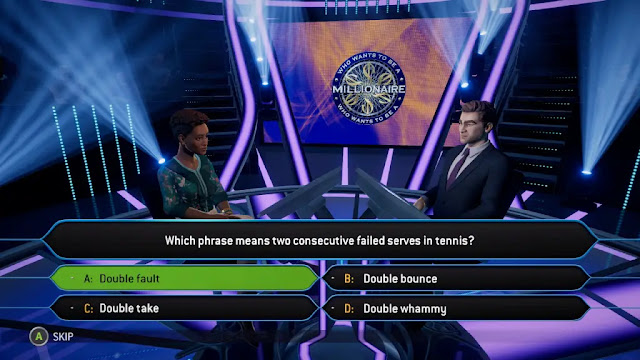
Video game adaptations of game shows can be a lot of fun. Just a look at my PS3 and you can find everything from Jeopardy to two different versions of The Price is Right. Some of these games get it right while others, not so well. I remember playing the very first video game version of Who wants to be a millionaire on the PC and although I was young and wasn't really good at it I still enjoyed it a lot. When the kid's edition game came out I enjoyed it that much more! But does the XB1 version hold up to the show?

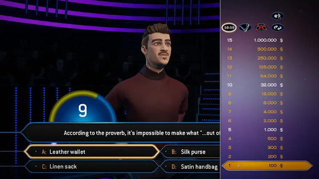
For anyone who doesn't know what Who wants to be a millionaire is, it's a game show where contestants must answer 15 multiple choice questions to win a million USD (Editor's Note: I am Canadian and with the exchange rate... our million is quite a lower number). The contestants do have a little help though with four lifelines that they can use at any time. To play, there are both single-player and local multiplayer options to pick from as well as an online options that pits you against 99 other players. At the time of this writing though, the game had not been released and so there are no other players to be found online.

The single-player mode is where I spent most of my time. In single-player mode, you can pick to play on normal mode or easy mode. Normal mode plays out like the show would on TV where as easy mode does away with the timer and gives out easier questions. In normal mode, you can pick the categories of questions you want as long as you pick 4 or more of them. There are also categories that are locked and require you to use an in-game currency to unlock. The better you do the more of this currency, or neurons as they call them, you will get.


Win $1000 and you get 40 Neurons. The locked categories range in price from 1000 neurons and up so unless your really good at the game it takes some time to unlock them all and that's a shame there are some categories I really would have liked to play right off the bat like Disney or Harry Potter. This type of currency works better on maybe unlocking new characters or outfits but when I was getting the same questions asked and I haven't even been playing for an hour then they should have had everything unlocked from the start.

In single-player mode, you get to select a character you want to play. Each one has their own jobs and interests but these don't seem to play into the game at all. In a game like this most people would want to play as themselves so why there are no options to create a character is a little baffling as most game show games or at least the ones I played on PS3 would let you. The host of the show is just some random guy. There is voice acting in this game but none of it is any good and if you are going to have a voiced host then he should at least read the questions.

Luckily you can skip all the chatting but I did run into one problem with skipping and that was if you skip the talking before a question it will just bring up the questions and answers and start the timer right away. If you don't skip it the game gives you time to read the question as the answers pop up and then start the timer once the answers are all up. The phone a friend lifeline is also voiced, you get to pick who to call out of a list like your character's sister for example and then they will chat but the question is never given they will just say if they think they know the answer or not. The host's hand movements and facial animations also don't match what is being said or done. One other thing that bugs me is when he asks “Is that your final answer” the character just goes on and says yes instead of asking the player to pick yes or no. Even the PC game that came out in 1999 asked the player.


I could never make it to a million but part of that problem was when I used the Ask the Audience lifeline more times than not it would always be wrong! Who was this game polling? One other thing I ran into was one of the questions that asked “When you're talking about someone and they suddenly show up it is often said “talk of the___” The right saying is "speak of the___" not talk. This makes me wonder if any other questions may be wrong as well.

The one thing I did like about the game was that it had an easy mode titled family mode. It asks easier questions so that even younger players can play. Each player can pick to play normal mode or easy mode so if you want to play on normal but your child wants to play on easy you can do that. The family mode is an elimination game where you keep playing until there is only one player left who answered right. There is also a coop mode that all players must answer right or they all lose. A free for all or take turns. Some of the modes only require one controller so if your like me and only have one Xbox one controller this is good.

Summary

Who wants to be a millionaire although fun in short bursts it just doesn't seem to be worth the price of the game at $29.99 for a physical copy of the game. There just isn't enough there and some things are done so badly like the voiceover and having to skip over most of the game due to the lines the characters say being so dumb.

It's more fun just to play along while watching the real show on TV. We will have to wait and see if the one vs 99 online modes will be any good but my guess is most games won't even reach 100 players. One of the only things they got right was music. It's all from the tv show and plays at the right times as it should.

Score: 4.5 / 10


Share:

Random posts

Our Streamers

Susan "Jagtress" N.


S.M. Carrière

Louis aka Esefine

Aldren


Affiliates

JenEricDesigns – Coffee that ships to the US and Canada

JenEricDesigns – Coffee that ships to the US and Canada
Light, Medium and Dark Roast Coffee available.

Blog Archive

Labels